How to Get More Followers on Twitter (the Semi-Legit Way)

Social media marketers put high value on the size of a following, so here’s a conversation that happens a lot between marketers.

Q: “How do I get more Twitter followers?”

A: “Tweet more, engage with people, share something useful or provocative.”

Sound familiar? Maybe you’ve heard this conversation or been part of it. Maybe dozens of times.

But here’s a less common question:

Q: “Why do some Twitter accounts grow faster than others?” 

This post answers that question. Then it goes into some practical tips to grow your Twitter following, including some of the more spammy tactics. Yes, we’re going to step over to the dark side of social media.

Quick disclaimer: before you scorch me in the comments, please understand that this post is informational only. These are not recommendations or judgements.

Why do some Twitter followings grow faster than others?

We analyzed the Twitter accounts of 300 bloggers and marketers to discover what actually correlates with follower growth. We used Follower Wonk to check the number of followers, number of tweets per week, total tweets over time and the likelihood of retweets.

Each of these correlates with follower growth at different rates. The findings might surprise you. Here’s the data.
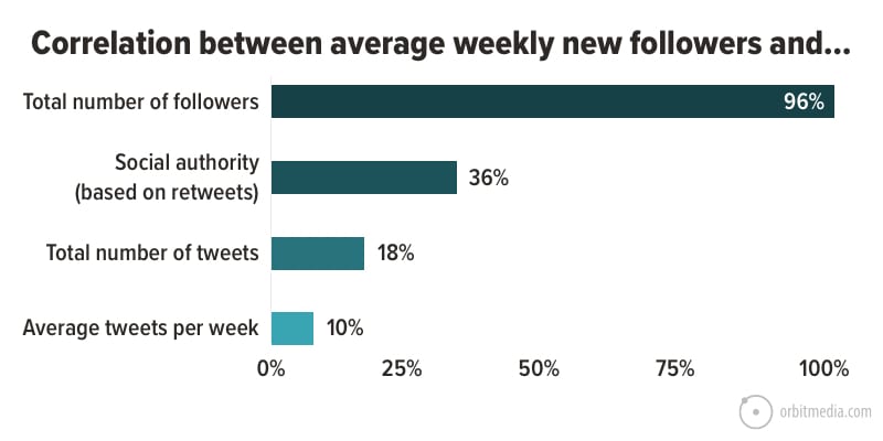
Surprised? I was.

  • Tweeting a lot DOES NOT correlate with follower growth.
    The statistical relationship is very weak. Only 10% of the accounts that tweet a lot are growing fast.
  • Getting retweeted DOES correlate with faster growth.
    In 35% of cases, Twitter accounts that get retweeted a lot are also the accounts that grow fast. This suggests that being engaging does help.
  • Big Twitter accounts grow much faster.
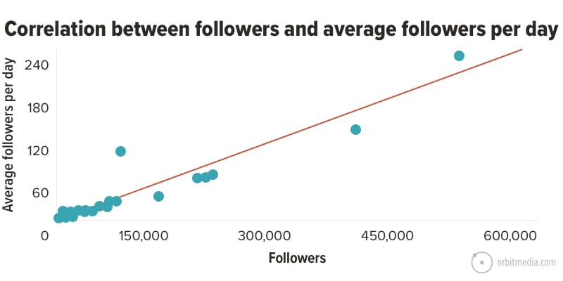
    Size matters a lot. The size of the following has a powerful relationship with the follower growth rate, much more than any other factor. Twitter accounts with large followings are the fastest growing accounts in 96% of cases.

Why do the big accounts grow faster?

It’s partly due to the design of Twitter. From the moment you set up a Twitter account, it starts recommending accounts with large followings. It promotes these accounts in many places and ways.

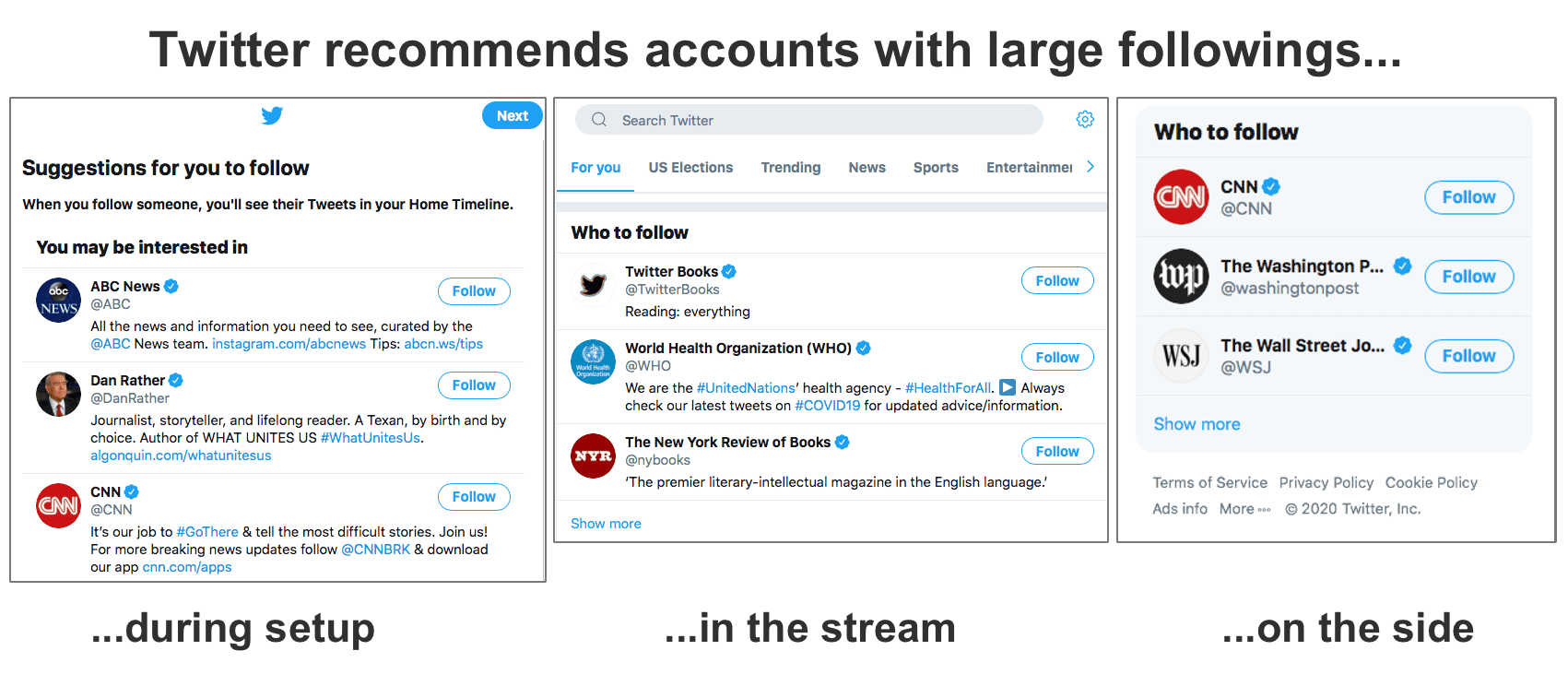
And then of course, there’s the bandwagon effect, aka the conformity bias. A lot of followers? It’s gotta be good! 

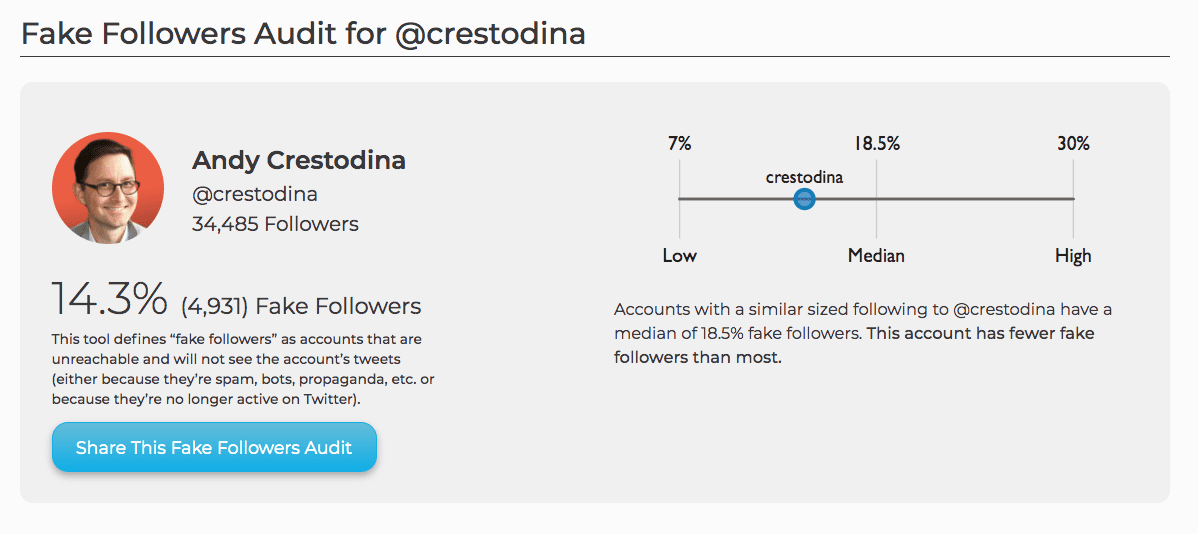
A large following is social proof. It’s evidence of legitimacy, even if that following is not an engaged audience. Even if a large percentage are fake.

No one checks for fake followers before clicking the follow button, right?

fake followers

Regardless of the reason, it’s clear that big accounts grow faster.

So it’s a chicken and egg problem. The key to getting more followers is to have a large Twitter following. But how do you get followers in the first place?

Here are ten ways to grow your Twitter following, from sketchy and spammy to human and high-touch.

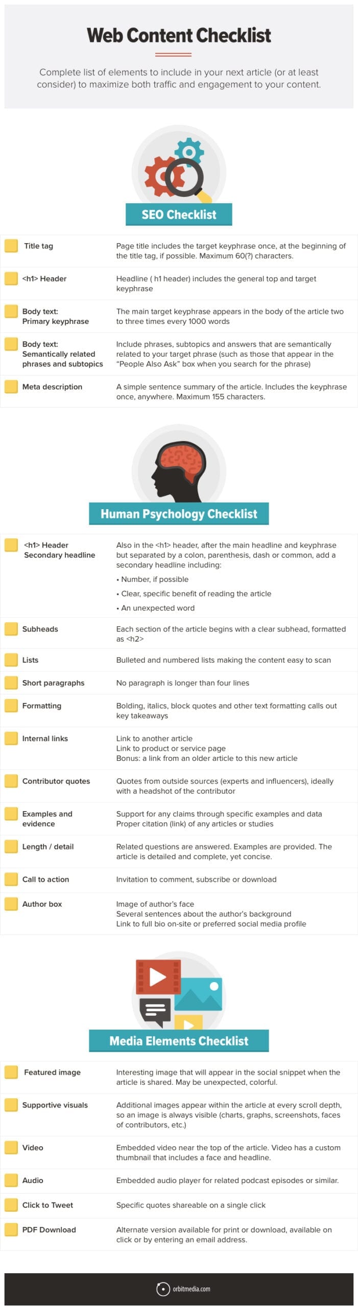
1.  Auto Follow / Auto Favorite

Rating:  Spammy 🤖

When you follow someone or favorite a tweet, you appear in their notifications.

Some of them will notice you, check you out and follow you back.

This is the most common way to inflate a following fast. It explains why a lot of random people may be engaging with you on Twitter.

These two activities, following and favoriting others, will gradually grow your account, but it’s slow …unless you automate it with a robot. Here are two tools for automating Twitter activity, so you can do social media without actually being social!

Note: We don’t use these tools. We aren’t recommending them. We are simply explaining one type of social media automation. 

  • Hypegrowth – Follows other accounts for you
  • TweetFavy – Favorites people’s tweets for you
  • ManageFlitter – Unfollows people who don’t follow you back (manual)

That last one keeps your following / followers ratio in balance. So your account looks less spammy.

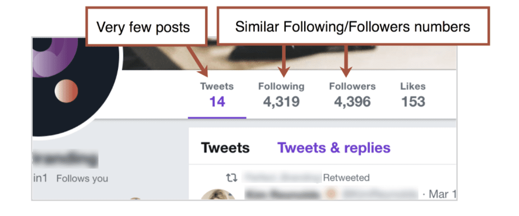
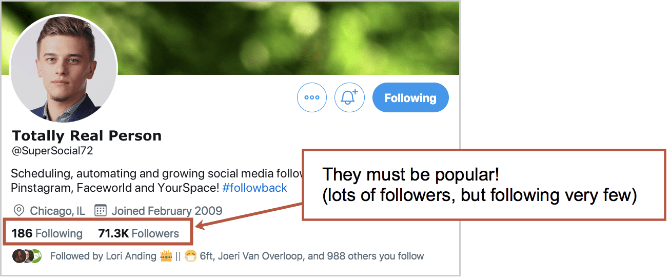
But these accounts are still easy to spot: lots of followers, the followers and following numbers are almost the same …and often and there are very few tweets.

If you’re simply trying to grow your following, you’re actually looking for spam accounts like these. Follow them and they’ll follow back.

Your robot and their robot can be friends!

Of course, these tools will win you a mostly irrelevant, unengaged following. Not very social, but hey, it was easy, right?

2. Manually follow, automatically unfollow

Rating: Sketchy

Rather than use a robot, you can do it by hand.

Spend a little time on Twitter every day and simply follow a bunch of people. Look for these Twitter users:

  • Anyone who looks likely to follow back (they have a close follower/following ratio)
  • Anyone with #followback or #TEAMFOLLOWBACK in their profile
  • Anyone with 10+ emojis in their bio, especially 🏆🏅🎯💰🔮🙌🌼🎧🎼

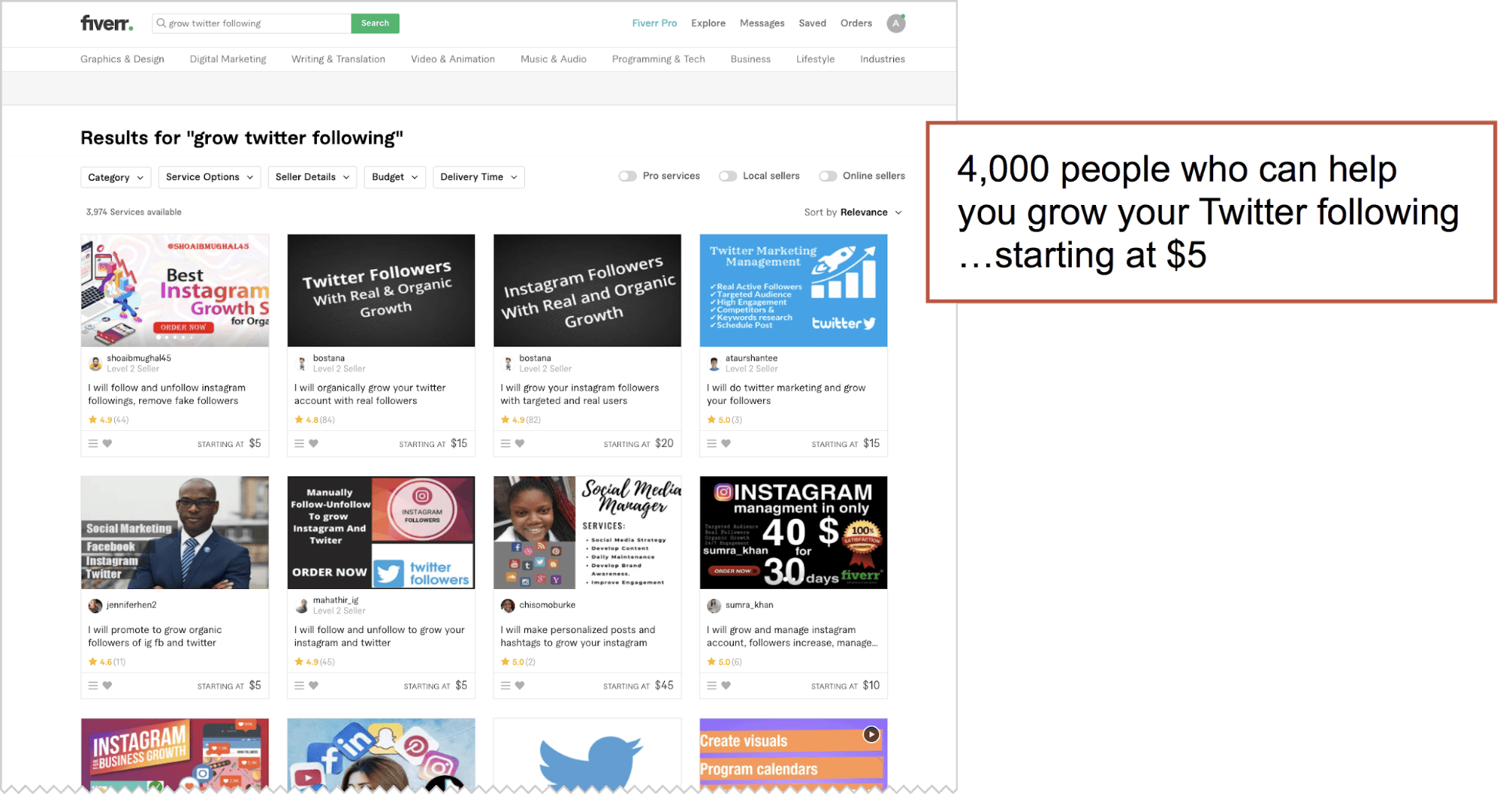
If the manual approach gets boring, you can find someone on Fiverr to do it for you.

3. “The Yank”

Rating: Sketchy

Here’s a way to create artificial fame. Use your new autofollow/followback robots to build up a large following of maybe 100k+ accounts. Then, on a sunny morning… unfollow everyone!

It’s known as the “mass unfollow” and here’s what it looks like. It’s also common on Instagram, not just Twitter.


Now, at a glance, you’ll appear to be loved by thousands …but you are quite picky about who you follow. You must be a rockstar. Put a velvet rope around your phone.

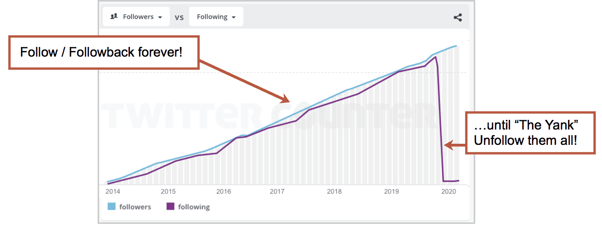
That’s the sketchy way to get 100k followers but only follow 10 people. Sure, you’ll hurt some feelings, but pseudo-celebrity has its price.

Interesting read: Chris Brogan (legitimate influencer and thought leader) did this back in 2011, partly as an experiment and partly to reduce direct message spam. He wrote about his experience here.

Now let’s move on to some more legitimate ways to grow a Twitter following.

4. Nail your profile picture

Rating: No-brainer

You’re trying to be more visible. To stand out. They won’t follow you if they don’t notice you.

These are our best tips for social media profile pictures. Here’s a quick summary for visibility in Twitter, where competition for attention is fierce:

  1. Warm colors stand out
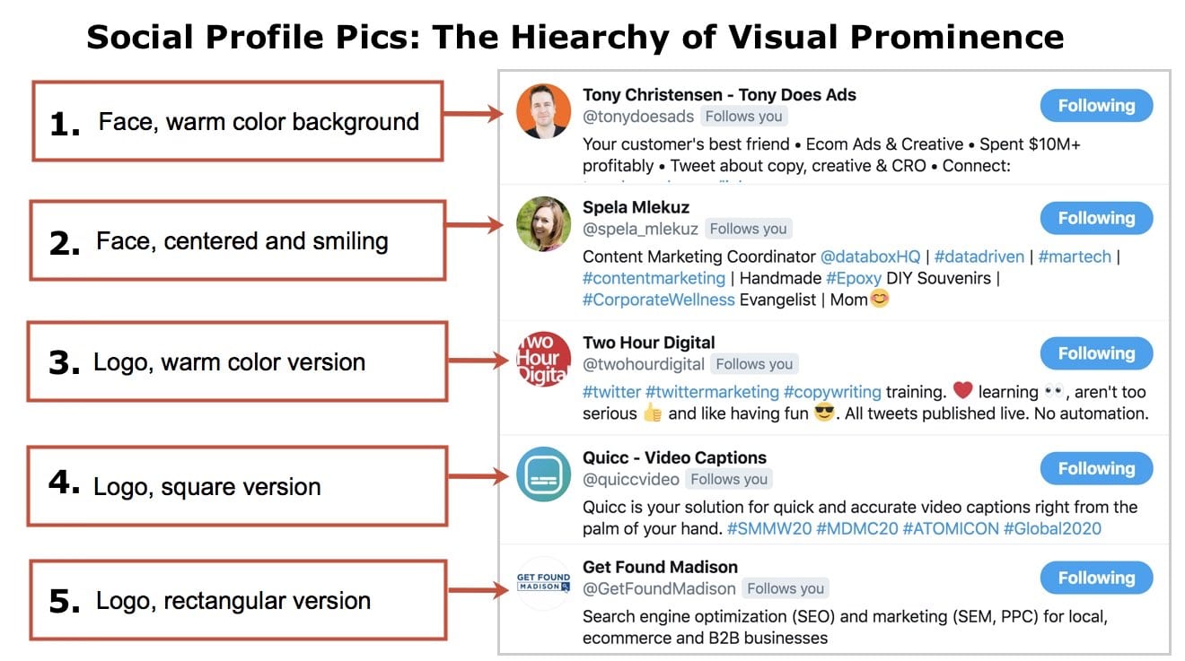
    The Twitter interface is dominated by cool colors (blues in the logo and UX) so warm colors stand out (red, orange and yellow). So a picture with
  2. Faces are more prominent than logos
    Be a person, if at all possible. Show your face and smile big for the camera.
  3. Rectangular logos look tiny
    Uploaded logos should have a square (1×1) aspect ratio. Upload a wide logo and it might be legible on your profile page, but too small to see in streams, where it’s squished down to 50 x 50 pixels or even 20 x 20 pixels in some places.

Put those together and you have a hierarchy for visual prominence in Twitter profile pictures. The profile pics at the top stand out much more, don’t they?

Once you’ve got your profile picture optimized for visual prominence, work on your header image. Make it non-boring. That means interesting, clever, unexpected, helpful or funny. And make sure it looks professional.

5. Write a descriptive Twitter bio

Rating: No-brainer

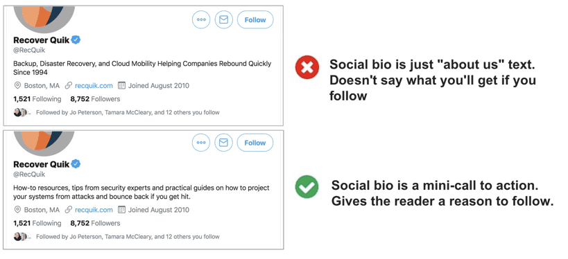
A lot of Twitter bios are just “About Us” content. That’s fine. But boring, maybe. Here are three ways to write a bio that grows your following:

Make your bio a call to action.

Some Twitter bios actually give people a reason to follow you. It tells them specifically what they’re going to get. Names the topics while adding a little credibility. A Twitter bio can be a little CTA.

Compare these two examples:

Optimize your bio to rank in Twitter search.

Another reason to write a descriptive bio is SEO. You can optimize your bio, making it more likely to appear in Twitter searches, by adding relevant keywords. Make sure a few keyphrases are in there. And make sure to add your city, if possible.

Twitter is still a research tool for a lot of users. Imagine you’re a prospect or journalist, looking for you. How do you search? What do you find?

Avoid hashtags in your bio.

For this, I have no evidence or research. But I do have common sense. Hashtags within bios aren’t likely to help your bio get found. They are really just little opportunities to leave your bio page. They’re actually competing with the follow button.


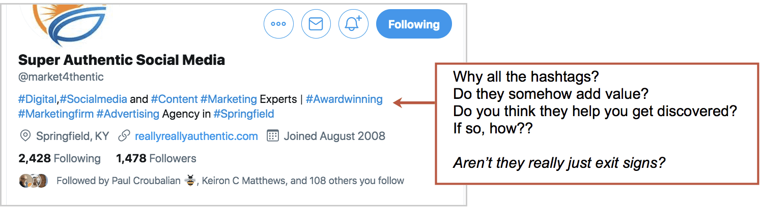
I’m all in for a hashtag (maybe two) on a tweet. But this isn’t a social post, it’s your bio. Hold the hashtags, please.

6. Find your top performing tweets and post them again

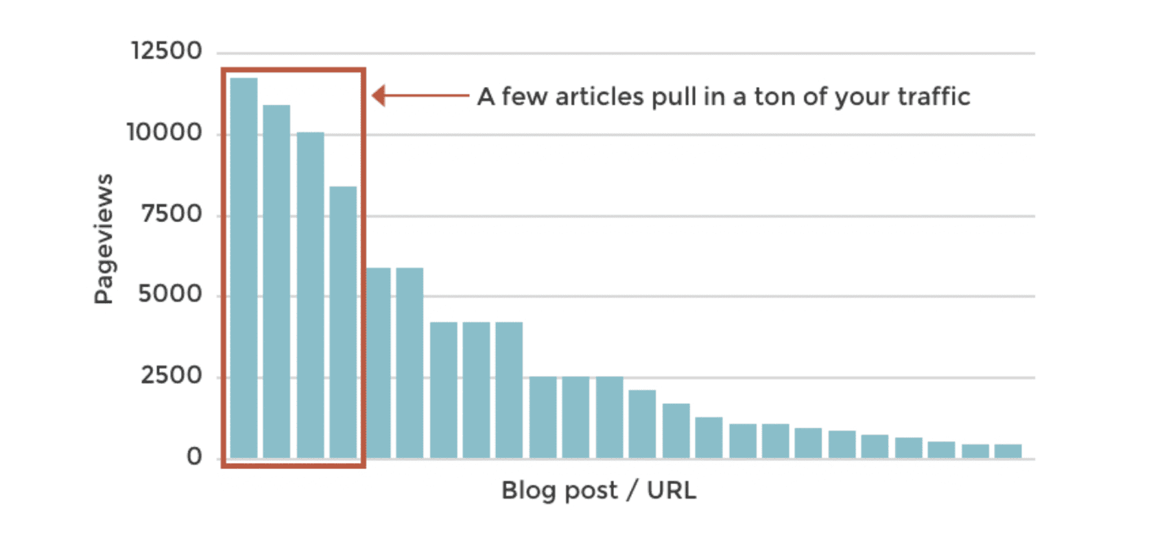
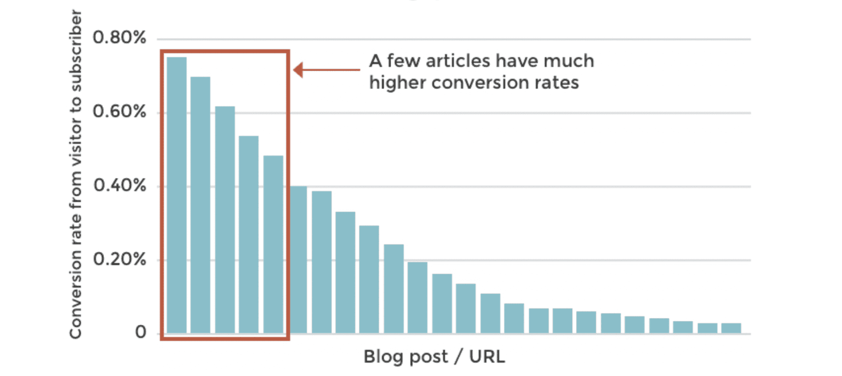
Some of your social posts are 10x and 100x as engaging as the others. They get exponentially more likes, shares and comments, so these posts are 100x more effective at making your account visible.

If you’re actively watching the streams, you know which posts get engagement.

If you schedule your tweets using a tool like Hootsuite or Buffer, check the analytics.

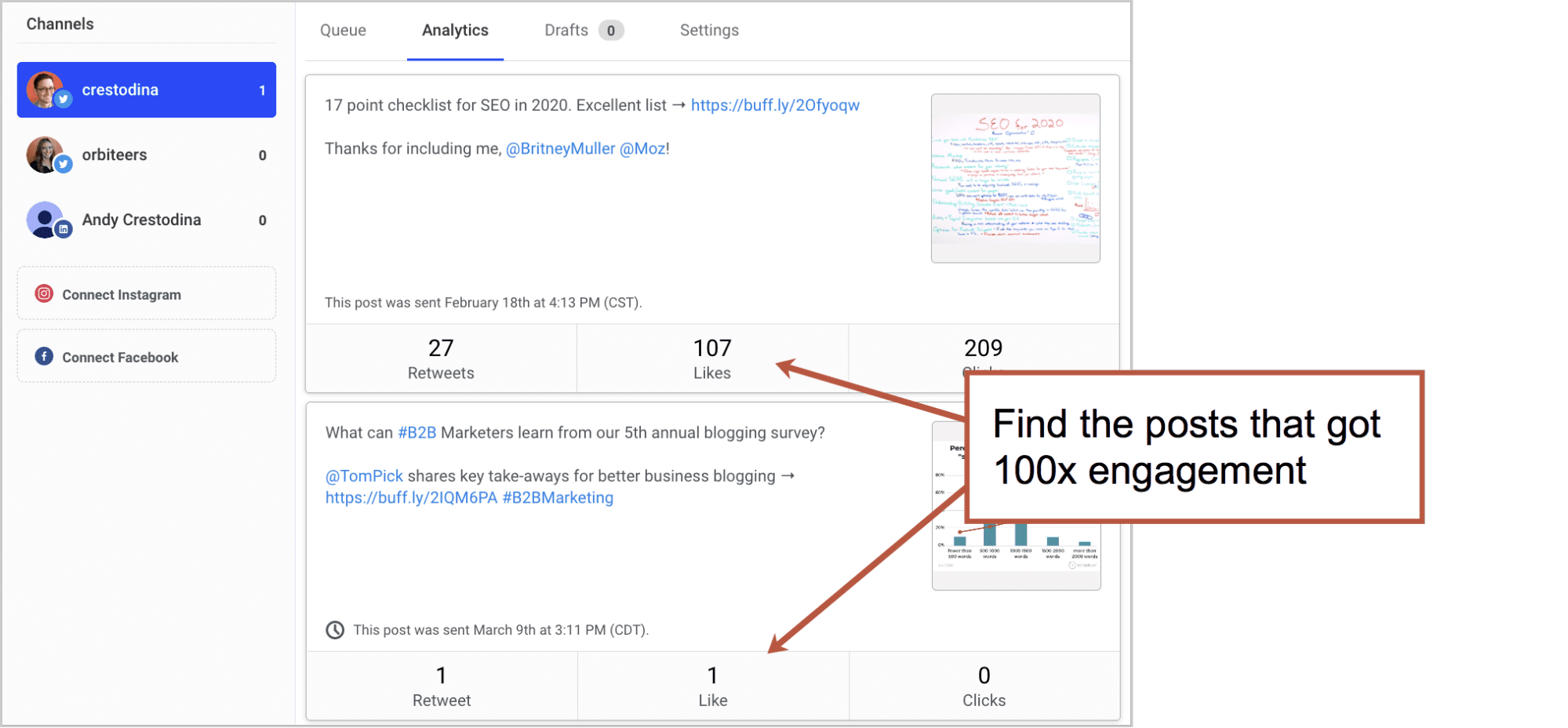
We don’t really care about clicks or traffic here. We’re just looking for visibility and follower growth.

You’ll probably find that a lot of the most engaging posts don’t even include links. They are sometimes just little tips or inspirational quotes

Keep tweeting these. Keep ‘em in rotation. And pin the best one to the top of your stream.

7. Tweet more

Now that you’re using data to decide what to share, this next tip will have huge value: increase your frequency.

Whatever your frequency was, double it.

There is no upper limit (that I know of) for how often to tweet. I know one marketer who tweets every 15 minutes. I know the guy. He has a huge following (500K+) and I asked him about frequency. He told me his goal is website traffic and that after testing, he learned that more is better.

Of course, you can’t spend all day manually tweeting. You’ll need a tool to automate these social media posts. Just turn up the dial and schedule more posts for more often.

That doesn’t mean you can set it and forget it. You still need to be there to engage with people who engage with your content. You still need to amplify.


Jay Baer, Convince and Convert

“You have to have it open. You can’t dive in and dive out. The way to grow a following is to be conversational and to add value to interesting, real-time conversations. You can’t do that if you post once a day at noon.


And beyond using Twitter for short posts, here’s a tip for bigger engagement through bigger content, right on the Twitter platform:


Jeremy Moser, uSERP

“Start creating content on Twitter itself. Use tweet-storm tactics and develop a thread of tweets surrounding a single topic. Within the thread, tag other active accounts, source quotes, and provide a coherent stream of consciousness on the subject. These are incredibly effective at getting compounding shares, as each threaded Tweet brings the original to the top of a user’s timeline. Mentioning others within these Tweet-storms takes advantage of Twitter’s algorithm, which now showcases what those users have liked (to their followers) directly on the timeline.


8. Find super-relevant people to share with

When you share something, whether you wrote it or not, share it with people who will love it. Twitter is a great way to find people with extremely specific interests.

If you wrote a post about personal branding, mention people with “personal branding” in their bio. They’ll likely thank you for it! They’re very likely to share it and follow you back.

Read the full post about targeted sharing on Twitter.

9. Link to your Twitter profile from everywhere

Let people know you’ve active on Twitter by linking to your Twitter bio every chance you get. Here’s a quick list of places where you can link to your Twitter account.

  • Your website
  • Your email signature
  • Your other social profiles
  • Your bio at the end of articles
  • Your presentations
  • Your physical signage

10. Connect with your friends from other networks

Twitter probably isn’t your only social network. You spend time in Facebook, Instagram, LinkedIn, Pinterest, WhatsApp, Reddit and Slack. You share, you engage, you make friends and you …can look for these same people on Twitter.

As you use other networks, keep Twitter open and in mind. Enjoying a conversation on another social media platform? Take a minute to find them on Twitter. There’s a good chance they’ll be happy to connect.

These will likely be high quality connections, since they’re people you already interact with.

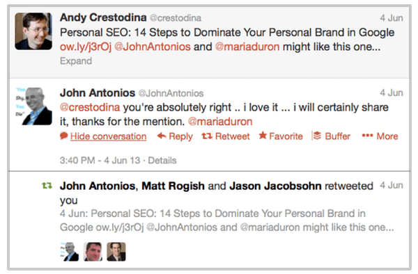
If they shared something of yours on another network, share it on Twitter, but mention them thanking them for sharing it earlier. They’ll be notified of the mention and they’re likely to share again (and follow you) when they see it on Twitter.

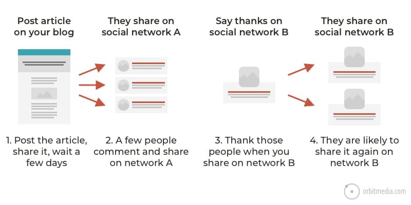
This builds stronger connections to more relevant connections, the ones that matter most in the end.


Tony Spencer, Take Spruce

“Social followings are more than just a number. If you want a social following that can make an impact on your business growth or success, they need to actually be interested in you or your brand. Otherwise, you have a bunch of followers who won’t convert.


Ask yourself: Why do you want a big following anyway?

Would the world be a better place if you have 100k followers? Would it really help your business? Your career? Your personal life?

Probably not.

Large Twitter followings are not usually very engaged audiences. And remember, organic reach in social media is low (likely only 2% of followers see anything you post in their stream).

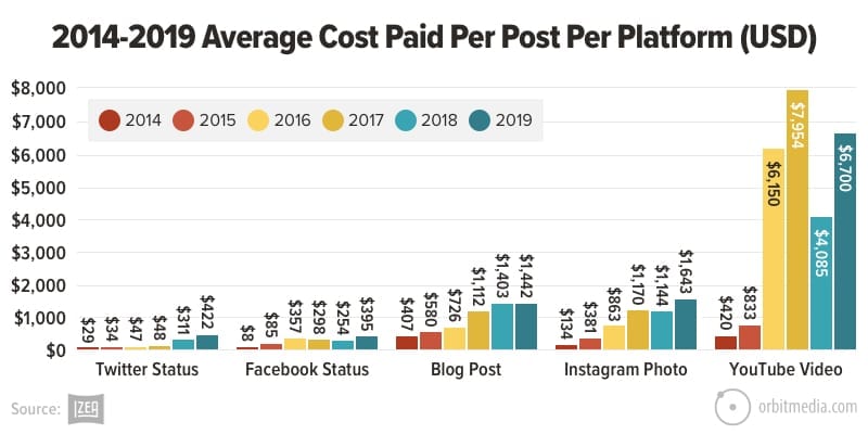
A large following in Twitter is worth less than other platforms. Here is the cost-per-post in paid influencer marketing. Only Facebook is lower.

So why the obsession?

Social media networks want us to obsess. They want us to stay on their platforms. They want us to play it like a game. That’s why they make the number of followers look like a score.

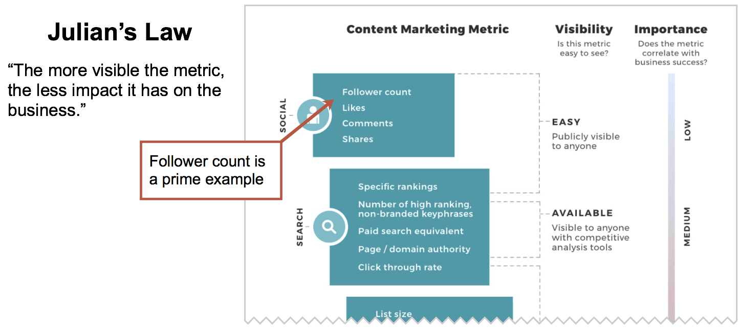
But the most visible metrics aren’t always the most important. In fact, the easier a metric is to see , the less impact it has on your business. We call that “Julian’s Law.”

In this post, we listed all of the content marketing metrics, from most visible/least important to least visible/most important. Here’s a preview of that post:


Followers, with benefits

If there are upsides to having a large Twitter following, they fall into a few categories. Each has their own factors in success.

  • Drive more website traffic? Yes, but only if…
    …your followers are engaged. Twitter is a powerful source of traffic, but only if your followers care enough to pay attention. If you have an auto-generated following or robots, you’re unlikely to capture this benefit.
  • Impress journalists and editors? Yes, but only if…
    …you already have their attention. Generally speaking, some content creators are more likely to be impressed and more likely to use you as a source. A large following is “social proof” which lends credibility in a PR context. This is a practical reason to want a large following.
  • Impress your friends? Yes, but only if…
    …your friends are into that kind of thing.

But the real benefits of Twitter (and of all social media and the internet as a whole) is the connections between people. It’s a powerful tool for research and networking, PR and influencer marketing. On Twitter, you can find almost anyone you can imagine and start a conversation.

Let’s close on a great quote from Ted Ruben:

“Make your social connections count or they won’t be worth counting.”

The post How to Get More Followers on Twitter (the Semi-Legit Way) appeared first on Orbit Media Studios.

from Orbit Media Studios https://www.orbitmedia.com/blog/how-to-get-more-twitter-followers/
via IFTTT

Web Content Best Practices: Our 22-Point Checklist for Publishing High-Performance Articles

The 80-20 Rule states that 80% of the results come from 20% of the causes. A small number of actions get big results.

Big in content marketing, it’s more like 90-10.

Every glimpse into every Google Analytics account shows this clearly. The top-performing articles drive most of the impact, both on the traffic side and the conversion side.

This is true for traffic.

A small percentage of articles get most of the visibility, especially through SEO…

And this is true for conversions.

A few articles are much better than others at getting visitors to subscribe…

One of the main jobs of the digital marketer is to find these high-performers and then understand them better. How are they different? What makes them special? How could you create more content like these?

But the conclusions are usually the same. There are common traits that the top performers share. And when you put these traits together, you have a set of best practices for website content and content marketing.

These are our web content best practices

They are based on our experience publishing 500+ articles, surveys of 5000+ bloggers, and collaboration with 1000+ clients. We’ve combined them into one, big web content checklist.

So before you push the publish button, go through this list and make sure you’ve included everything. If you leave something off, do it deliberately.

We’ve broken this up into three separate lists, one for SEO, one for human psychology and one for additional media. Of course, there is overlap.

Here’s a printable PDF in case you’d like to check things off a paper list as you write your next post.

Download my checklist

Let’s take a closer look at each item…


Search Engine Optimization (SEO) checklist

We’ll start with SEO and traffic. Makes sense. If no one sees it, nothing else matters, right?

The following elements help indicate the relevance of the article. They are key places to use target phrases and increase the likelihood that the content will rank. Just make sure that you’re targeting a keyphrase that you have a fighting chance of ranking for.

Title tag

It’s in the tab above the address bar for every page you’ve ever visited.

Title tags are the single most important element for on-page SEO. Not only are they a powerful indication of relevance, but typically the title is the link on a search results page. The ideal length is 55 characters or the rest will be truncated. Be brief.

Use the target keyphrase once in the title. If possible, use it near the beginning of the title. The prominence of the keyphrase (in other words, how close to the beginning it appears) is important.

It might be tempting to put your business name at the front of the title. Don’t. SEOs have a saying: “brand last.” Start with your keyphrase, end with your business name. Remember, in content marketing your first goal is to help people. Promoting yourself comes second.

<H1> header

The header on the page should be formatted using the <h1> header tag. Use the target keyphrase once, indicating relevance to search engines and stating the general topic to headers. Beyond this, the headline should be written for readers. More on headlines in a minute.

Keyphrase use in the body text

Your target keyphrase should appear in the article. As you write, you’ll find yourself using the phrase naturally at least a few times.

There is no rule for the number of times you should use a phrase (it would be strange if there was) but if you’d like a general guideline, I’d say use the phrase 2-3 times every 1000 words. Something like that.

During editing, make sure it’s used, but not overused.

Warning: If it feels unnatural, don’t force it. Don’t overdo it on the keywords. Do not compromise your writing. If your keyword usage is obvious to a reader, you’re guilty of “keyword stuffing.” Repeating a phrase in unnatural ways is bad for readers and bad for rankings.

Semantically linked words

Here’s where SEO copywriting gets more fun.

Beyond using your target keyphrase, work in the words that are semantically related to that phrase. This is how you can target the topic, not just the keyphrase.

Indicating relevance for the more general topic is great for search rankings. A great page on your topic would certainly include closely related words and phrases, right?

For example, this article is a “website content checklist.” That’s the primary keyphrase and I’m using it, I’m sure (I’m not actually counting how many times). But a great content checklist should really touch on all the adjacent subtopics, relevant questions and related words.

So I’ll take a minute to see what Google shows as related words, topics and questions and incorporate those into this article.

Where do I find those?

  • I just start searching for the phrase and see what Google suggests.
    I write those words and phrases down and work those into my article.
  • I search for the phrase and look for a “People also ask” box.
    I write those questions down and make sure to answer some of them in my content.

This is the key to semantic SEO and the future of search engine optimization.

During this process, you’ll find yourself writing a more detailed, helpful article. Yes, SEO can make you a better writer.

Meta description

Although meta keywords are totally useless, the meta description remains important. Just like the title, it doesn’t appear in the content of the page, but it’s highly visible in search results.

The text in the search snippet is either an excerpt from the body text or the meta description. It’s a chance to sell your article and increase the clickthrough rate. So make it good.

Your meta description should be a single sentence, plain English summary of the content of the page. Use your target keyphrase at least once, but not more than twice. Limit it to 155 characters to be sure that it will fit within the snippet without getting truncated.


Human psychology content checklist

Each item in this next set of elements will align the blog post with human psychology. These can improve click through rates, time on page, bounce rates and conversion rates.

H1 header secondary headline

A headline is a promise. A great headline is a strong promise, giving the reader specific benefits to slow down, click and dive into the article.

Some of the top-performing headlines and actually like two little headlines smushed together. They name the topic, then name the benefit of clicking. After the keyword, add a dash, colon or parentheses, then then add a second headline with the benefit of clicking.

Here are examples of double headlines that separate the first from the second with punctuation. Each leverages another technique to catch readers’ attention

  • Use a number
    The Complete Hamster Training Guide: 5 Circus Tricks Rodents Love
  • Promise a specific benefit
    Hamster Training Tips – How To Train Your Hamster to Jump Through Hoops
  • Create urgency
    Train Your Pet Hamster (Before He Escapes Forever)
  • Trigger curiosity or emotion
    Hamster Training: This Furry Guy Learned This Trick in Just 10 Minutes
  • Ask a question
    What Tricks Can You Teach A Hamster? Training Advice from a Pet Rodent Expert

Resource: How to Write Truly Great Headlines.  That post has everything you need to win the click.

Subheads

Visitors aren’t really readers. They’re scanners who might read if we can slow them down. According to one study, visitors are reading 28% of words at most.

Adding subheads can slow down the scan reader. Break up your article into sections. These serve as mini-headlines for subsequent paragraphs, keeping visitors flowing through your content.

These subheads should be formatted using <h2> or <h3> tags, not just bolding.

Don’t worry too much about SEO and keywords when writing subheads. Go ahead and be as clever as you’d like. This is also a great place to use any headlines you rejected for the <h1> header.

Lists

A list-based article gives you a natural reason to use a number in your headline, telling busy readers that the article will be easy to scan. If it looks like a list, it’s an easier click.

But little lists can appear throughout the article. As in…

  • Use bullet lists whenever there are three or more distinct ideas in a section
  • Use numbered lists as a format for the entire article or whenever sequential ideas are presented
  • Avoid list formatting when telling stories with a narrative flow

Short Paragraphs

This isn’t college and your article isn’t assigned reading. So don’t make it look like a textbook. The back button is right there in the corner and they know it.

No paragraph should be longer than four lines maximum. Occasionally, drop in a very short paragraph of one sentence or even one word to add emphasis.

Designers have always known the power of whitespace. But somehow, writers didn’t get the memo.

Formatting

Subheads, lists and short paragraphs go a long way, but they aren’t the only way to make content more scannable.

  • Bolding, Italics
    Excellent ways to add emphasis and make content more easily scanned, but don’t overdo it.
  • Block quotes
    Your website should have options to call out key messages, just as newspapers and magazines have done for years.
  • Personal tone
    Readers are people. Write as if you’re writing for one, specific person. From you, to her.

Internal Links

Your goal is to eventually convert your reader into a lead or a customer. That means guiding them deeper into the site, and that means internal links.

“Your site is the mousetrap, your content is the cheese.” – Barry Feldman

If you don’t help make those connections between the cheese and the trap, you catch fewer mice. Here are four types of links to create every time you publish:

  • Link from the new article to a relevant older article
  • Link to the new article from an older article
  • Link from every article to a product or service page
  • Link from each article to the article of an authority or expert with supportive content (see below)

There is also an SEO benefit here. Links between pages help pass ranking potential between pages on your site, although these links have far lower impact on rankings than links from other websites. Internal links are also an easy opportunity to use target keywords in anchor text.

Resource: 3 Internal Linking Strategies for SEO

Contributor quotes

If optimizing for search means adding keywords, then optimizing for social means adding people. There are three main benefits to publishing collaborative content.

    • Improve the quality of the article
      The outside points of view adds both insight and credibility.
    • Improve the social reach
      The contributors may share the piece, improving the social reach. An ally in creation is an ally in promotion. This is sometimes called “ego bait.”
    • Grow your professional network. 
      Every article is a networking opportunity. Most people love to contribute to things. To them, you are a press hit.

Bonus: You can even use content as a way to open doors with influencers and potential clients. This is called zero-waste marketing because it creates value even before the piece is published.

Adding sources is easy. While writing, just reach out to an expert or influencer and ask them if they’d like to contribute a few sentences. If they do, add their picture and link to their website. Once it’s live, let them know.

It takes forethought, but it’s actually the least time consuming part of the content creation process.

Source: How to Write a Blog Post for SEO (Step-by-step video)

Examples and evidence

Great writers add evidence to support their claims. They add examples to improve clarity. Ideally, every point in your article is supported with data and examples.

There are at least five types of evidence that you can make your content more compelling.

  1. Research studies and statistics
  2. Charts and graphs with supportive data
  3. Stories and case studies
  4. Supportive resources
  5. Relevant (positive or negative) examples

If you cite research from others, make sure to let them know, if only by mentioning (and tagging) them when you share the article. They might notice and then share from their own channels. More mentions, more potential social reach.

Better yet, make the article itself a research piece. When you conduct your own original research, you make your brand the primary source for new data.

Sound ambitious? Maybe not. It’s actually becoming common, according to our own research on blogging.

The rise of original research among bloggers

Length and detail

Great articles are complete. They answer all of the top related questions. They don’t skip steps. They don’t stop short. They cover the topic completely.

But there is no ideal length for blog posts. So don’t start with a target word count. Yes, there is an average length for blog posts: 1269 words. That’s long. And it’s gotten longer year after year.

Blog posts keep getting longer. The average is now 1,269 words.

But length is not a search ranking factor. That’s why we’re in the “human psychology” section, not the “SEO” section. Using semantic SEO writing techniques may lead to higher word counts, but word count is never the point.

Yes, there are many studies that show a correlation between length and high-rankings, but writers who add length for SEO are likely adding fluff.

Do it for your readers, not for Google.

Detailed articles are engaging. They hold readers’ attention. You can check for yourself using your own data. Create a scatter plot chart using word count and time on page for your top articles.

We did and here’s what it looked like for us.

So how long should your article be? It depends on the topic.

Every blog post should be as long as necessary to cover the topic completely, and not a single word longer.

Calls to Action

Now that you’ve given your reader a detailed, high-quality, carefully constructed article, it’s time to let them show their gratitude. Every great post has a CTA.

“Subscribe.”

That’s the typical call to action for blog posts.

It’s the popup window. It’s in the right rail. It’s “in-line” within the body of the article. It’s the header of the blog. It’s the sticky footer you see below.

Wherever it appears, it should include three things: prominence, promise and proof. These are the three p’s of high converting email signup forms.

If not subscribe, the call to action can also be an invitation to leave a comment. End the post with a question they can answer with a comment. Or ask the reader to share other ideas that would complement the article. Or even invite the reader to disagree with you.

Author box

Your content management system probably makes adding a nice author box easy. Easy or hard, it’s worth the effort since it has social media and conversion benefits. The ideal author box includes the following:

  • Profile picture
  • Brief biography (usually just a few sentences)
  • Link to the author’s bio and other articles on your website
  • Link to other social media profiles


Media and visuals checklist

Here are ways to improve quality by adding more compelling media. Of course, you won’t add all of these to every article. But we recommend upgrading your content with these whenever possible. The more, the better.

Featured image

Articles with compelling images are more likely to be shared and clicked in social media. Content without a strong visual is not going to win attention in social streams. Images also make your message more memorable, thanks to the pictorial superiority effect.

Never publish an article without an image.

The featured image at the top of the article will likely be used in the social snippet if the article is shared. Most social media sites show a rectangular area of the image, which is roughly twice as wide as it is tall.

This “aspect ratio” of 16:9 means square-ish images get cropped. So images optimized for social media meet one of these two criteria:

  • They have a 16:9 letterbox aspect ratio or…
  • The main subject of the image is within the center vertically, rather than near the top or bottom.

Optional: Add the headline of the article (or a version of it) into the image itself to make it more meaningful, increasing the chance that it will get clicked when shared on social media.

We put our favorite blog image research and tips into this post.

Supportive visuals

Add an image every 500 pixels or so (every three or four paragraphs) to add visual interest at every scroll depth. In other words, at no point in your article will there be a screen of all text with no images.

The impact is measurable. A tool like Hotjar has scroll heatmaps that show how far down your visitors flow. The impact of multiple images is often dramatic.

Video

The combination of movement and sound make video a super compelling format for content. Adding video to the top of your posts is a powerful content strategy and a great way to get visitors to stick around.

We track the impact of video on website engagement using event tracking in Google Analytics. There is a huge difference in behavior between visitors who watch and visitors who do not. This is what it looks like in Analytics:

To maximize the percentage of visitors who watch the video (let’s call that the “view rate”) use a custom thumbnail with both the headline and a face. Here’s an example of a high-performing video thumbnail.

Audio

Similar to video, audio is a big media upgrade to any post. It’s also easier than you think.

  1. Turn the recording software on your computer
  2. Read the post in your own conversational tone
  3. Save as an mp3 file
  4. Upload to Soundcloud or Spreaker
  5. Embed the audio player of the file to the page by copying and pasting in the <iframe> code, just as you would a YouTube video.

It will look (and maybe sound) like this:

Click to Tweet

The easier it is to share, the more likely it will be shared. This is another simple way to optimize your content for social media.

Take a short, compelling quote from the article and write it as a tweet, using the link from the article, along with any hashtags and mentions. Put the tweet into Click to Tweet, then embed it into the article as a link or a little blue bird button.

It will look something like this:

PDF Download

The PDF is really a print simulation. It’s definitely not digital content best practices to make this the only version of an article.

But when the PDF is an alternate version of an article, added as a convenience for visitors who may want to download or print, then it’s added value.

The PDF is also a common format for the “lead magnet” or “content upgrade,” available to visitors who enter an email address. Of course, this kind of “gated content” is the cornerstone of marketing automation.

Links to PDFs can include an icon and an indication of the file size, similar to this:

PDF Download a PDF version of this Website Content Checklist (236 kb) >

Or include a button like this:

Download My checklist [PDF]

“Copy is not written. Copy is assembled”

These are the words of copywriting legend Eugene Schwartz. They’ve never been more true than today, in the era of content marketing.

A great piece of digital content is assembled from many little elements, words, images, tags, media and formatting. Each adds to the results in its own small way.

Did we miss anything? Anything to add? Trade tips with your fellow readers by adding a comment below.

The post Web Content Best Practices: Our 22-Point Checklist for Publishing High-Performance Articles appeared first on Orbit Media Studios.

from Orbit Media Studios https://www.orbitmedia.com/blog/web-content-checklist-17-ways-to-publish-better-content/
via IFTTT

How to use Infographic Data Visualization to Attract Qualified Leads

‘Show, don’t tell’ isn’t just a term in entertainment—it’s fundamental to content marketing and exemplified in infographic data visualizations.

As the world moves increasingly online, visuals have become the key to engaging audiences—especially as brains process images 60,000 times faster than text. But, why infographics, you may ask?

Infographics are an excellent visual tool that combines text, charts, imagery, icons, and colors to tell memorable brand stories. These data visualization examples showcase how powerful and memorable infographics can be. They also position companies to share compelling stories to attract qualified leads.

In this article, we share seven tips so you can create data infographics that will boost your brand awareness and revenue.

1. Use the right kinds of infographic data visualization

Creating infographics that are meaningful and easy to understand can be tricky. For marketing teams without much experience with design, data visualizations become a huge hurdle.

But it doesn’t have to be this way. First, you need to understand some basics, such as how many kinds of data visualizations are available:

  • Charts
  • Diagrams
  • Maps

Now, some of these individual categories include a variety of visualizations, as well. Charts include the following:

  • Bar charts
  • Bubble charts
  • Line charts
  • Pictographs
  • Pie charts
  • Scatter charts
  • Wordgraphs

Diagrams can also be broken down into:

  • Fishbone diagrams
  • Flow charts
  • Mind maps
  • Wireframes

With so many options available, choosing the right visual becomes an obstacle for designers and marketers—and it happens early on in the creative process. So, which visual should you use for your infographic?

To make the right choice, you need to define the point of your data and your story. That is how you can pick a visual that conveys your message.

Here’s a simple infographic that clarifies how the different infographic data visualizations work.

infographic charts

Source: Venngage

Let’s break it down further. If you have one point of data—1/4 people surveyed used our tool—a pictograph will be sufficient to depict that information.

However, if you have multiple points of data that need to be compared, a bar chart will be able to convey the information to audiences better. In this product marketing chart from TryChameleon, you can see how multiple KPIs stack up against each other.

product marketing chart

Depending on the focus of your graphic and how many data points you have to share, you can choose the right visual to share your message with prospective leads.

2. Create trust with infographic data visualization

Trust is imperative in marketing—and when you are sharing data, it becomes even more important.

One of the best ways to build trust among leads is to compile your data from credible sources, that are unbiased and objective. Also, verify your data with at least two additional sources to ensure that the studies can be replicated.

Another way to portray trustworthiness is by visualizing your infographic data correctly. Look at the graphic on fast food below. While it clearly states which companies are bringing in sales, the comparison is distorted.

fast food chart

Using logos, which come in a variety of shapes, has distorted the data—because the logos can’t be transformed correctly. This leads to a massive imbalance in scale that doesn’t correspond to the numbers presented.

On the other hand, this stacked bar graph on digital transformation includes a clear axis and legend that shows the data at scale.

data at scale

Here’s how you can avoid data distortions that could potentially lose users’ trust in your brand:

  • Include a scale for your data so your information isn’t distorted
  • Don’t start your data baseline at points above zero
  • Don’t skew the size of the axes
  • Include both axes in the graphic
  • Avoid cherry-picking data to suit your message
  • Pick the right charts for your data
  • Stick to the norms of data visualization that your leads are accustomed to

Following these points will make it easier for you to create infographics that build trust in your leads.

3. Keep infographic data visualization simple

Designers can be tempted to create complex infographics—when you have a lot of data to share, designing a multi-layered graphic seems like the best option. But that isn’t the best way to approach design. According to a study on graphic design trends, simple infographic data visualizations are the norm.

This is because complex data should be simplified for the audience—if your design is complicated, people won’t understand it. Nor will they be able to decipher the data.

By overburdening the graphic with data, like in the example below, you run the risk of losing your audience.

bad data visualization

This infographic has so many colors and so many pie charts that potential leads will have no idea where to look or how the data points correspond to each other. Users will spend more time deciphering it than understanding the data—which will inevitably lead them to scroll past your content.

Data visualizations must stand on their own—when a person looks at it, they should be able to understand what information it includes and what the data means, like in this example.

houston real estate trends

Source: Venngage

This infographic can be easily consumed—the graphs are simple, the images are relevant to the topic, and the icons give the data context. While you can write a blog around your data to share your methodology, your data shouldn’t need additional information to make them understandable.

Infographics need to stand on their own to tell your story. With a simple visual, you can do just that and attract prospects to your brand to boost conversions.

4. Limit text in your infographic data visualization

The great thing about infographics is that you can combine text and graphics to share a complex story. But when you visualize data poorly, you end up adding too much text on the graphic to explain what the data is about, like in this example.

anatomy of winning a ted talk graph

The graphic doesn’t convey any information on its own—users have to read the sidebar to understand the data. That shouldn’t be the aim of infographic data visualizations—if you want people to read your graphic, you might as well create a blog.

The point of visual communication is to build connections between data—and to share information with as wide an audience as possible. If your charts aren’t standing on their own, then you haven’t chosen the right ones. Or, you’re trying to share more data than is necessary.

Make your data bite-sized and easy to consume, especially when you’re trying to reach multiple leads with a single graphic. The best way to do that is by using less text and more relevant visuals like icons, images, and illustrations, like in this example.

refugees chart

Typography and text should be a last-minute resort—used only when a visual can’t convey a data point. That is the best way to attract leads and increase conversions.

5. Using color in infographic data visualizations

Colors are an important part of visuals—they serve multiple purposes and give marketers a range of options for sharing their data. However, marketers and designers need to be careful when they incorporate colors in their infographic data visualizations.

Just because you have access to a large swathe of colors, doesn’t mean you use all of them. The color palette you choose should include a handful of colors, at the most.

Too many colors can become overwhelming, while too few will create connections between data that don’t exist. Three to five colors should be more than enough to convey information.

Keep your brand colors in mind when choosing colors—you don’t want to choose a palette that is similar to a competitor’s. Look at these Instagram statistics and how they use the brand colors for the platform to illustrate the chart.

instagram chart

You could also use different hues of one color. Or reduce color transparency to give your visuals more range. Remember that colors must have a purpose within your design—to convey information or to evoke a particular feeling within the user.

If you want to know how to choose a color palette, you can refer to this graphic.

color combinations

Source: Venngage

Colors already have a role to play in society—green means ‘go’ or ‘earthy’, while red is associated with ‘alert’ or ‘danger’, and blue makes people think of ‘coolness’ or ‘serenity’. When you create data visualizations, note how colors are perceived by users before you include them in your infographics.

Also, keep in mind that muted colors have been on-trend for the past couple of years and are showing no signs of abating. The color palette you choose for your infographic data visualizations should be muted—bright and bold colors will look jarring to audiences.

To understand the difference between muted colors and bold colors, here’s a simple graphic.

muted bold colors

Source: Venngage

A muted color palette doesn’t decrease the range of colors designers can use—but it makes visuals look more authentic and organic than bold colors.

6. Create hierarchies in infographic data visualizations

Your infographic needs to have a visual hierarchy—this will help users follow your infographic story as you mean to tell it. A visual hierarchy is an essential component of communication—because people assign context and importance to the patterns they observe.

You want users to find correlations in your data through the visual itself—and you can do this by creating a distinct hierarchy. There are numerous ways that you can create visual hierarchies within your infographic:

  • Different color hues
  • Decreasing font sizes
  • Grouping related elements together
  • Placement of text and visuals
  • Styling elements differently

Look at this example that depicts market segmentation for computer consumers.

computer consumer stats

Source: Venngage

The bar chart shows the market share hierarchy through the size of the bars and the color gradient. Users can infer the results of the research just by looking at the infographic—they don’t need any further explanation.

That should be the aim when creating visual hierarchies in your infographic—for users to be able to understand the data correlations at a glance.

7. Highlight information in infographic data visualizations

When you create a visual, you need to highlight key data instead of making your users seek it out. This is particularly important when you have complex data to share, or numerous percentages and numbers.

It can become confusing for users if you don’t draw their eye to the pertinent information. One way to do this is by using icons in infographics—they are a great tool to convey stories.

When paired with captions, icons also highlight important data in visuals. For example, look at the icon infographic below.

child labor stats

Source: Venngage

This visual is packed with data but the viewer never feels lost because the icons, text, and colors create a cohesive, albeit heartbreaking, story. Remember: when you’re trying to attract leads, the data you share should be relevant to them.

Gathering data and building a story around it takes time. When you create a visual to relay that story, you want to ensure that your users understand it easily.

By highlighting key components in the graphic, you can draw your audience’s interest and grow your leads.

Key takeaways: Understand the story behind your infographic data visualizations

Creating great infographic data visualizations can be a challenge. But when done right, these visuals can attract leads and boost conversion rates.

To recap, here are the seven ways data visualization can increase awareness of your brand:

  • Choosing the right kinds of graphics
  • Building trust in leads
  • Keeping visuals simple
  • Limiting text on visuals
  • Color use in visuals
  • Creating data hierarchies
  • Highlighting key information

With these points, your marketing and design team can source data and create visuals that will draw audiences to your brand.

The post How to use Infographic Data Visualization to Attract Qualified Leads appeared first on Orbit Media Studios.

from Orbit Media Studios https://www.orbitmedia.com/blog/infographic-data-visualization/
via IFTTT

How to Understand Your Website Traffic Sources (Plus, 18 Tips to Increase Website Traffic)

Where there’s traffic, there’s hope.

Because every visit is a chance for something good to happen.

That’s why increasing website traffic is the first goal of most digital marketing strategies. It’s the equivalent of traditional marketing’s goal of brand awareness.

If we’re going to spend all this time, energy (and maybe money) to generate traffic, let’s first spend a few minutes to understand the sources of website traffic, how they’re defined and how they’re measured.

    • How is website traffic measured? Categorized?
    • How can I increase traffic from each traffic source?
  • How accurate are traffic sources in Google Analytics?

This guide breaks down the traffic sources of website traffic and includes tips for increasing traffic from each.

Traffic Source
Visitor Action*
Context/Intent
Paid … clicked an ad …impatient. Wants something specific.
Organic search …clicked on a link in a search engine …knows what they want
Social …clicked a link in social media …just browsing the web
Email …clicked a link in an email …been here before
Direct …typed the address into a browser …remembers us, or heard about us
Referral …came from another website …interested in learning more

*Not always the case, this guide shows why these aren’t quite what they seem.

Here’s how the traffic sources look in Google Analytics.

Assuming that marketing campaigns (such as advertising and email newsletters) are tracked using UTM tracking codes with a URL builder, this is what the Acquisitions > All Traffic > Channels report will look like. To see the percentage view, click on the pie chart.

website traffic sources by percentage

If you switch back to the data view, you’ll see behavior metrics (bounce rate, pages per visit, average length of a visit) and the conversion metrics (the percentage of visitors who took action) for each source of traffic.

Useful for tracking the effectiveness of various marketing efforts.

website traffic sources and conversion data
Let’s look more closely at each specific source of website traffic. But first, here’s a helpful way to think about the sources and the efforts that make them go.

Oars, Sails and Motors

Here’s a fun little metaphor we’ll use to help us understand the sources of traffic to websites.

Imagine weighing anchor and heading out to sea for a fishing trip. The farther you go, the more fish you’ll catch. You want to go far, go fast and you don’t want to break your bank account (or your back) in the process.

You’ve got a few options: sail, row or fire up the motor.

value of website traffic sources

1. Paid advertising (The motor)

Anyone can buy traffic. Social ads, pay per click, retargeting and banner ads (usually called display ads) are certainly one way to get the boat moving.

Here are the defining traits of paid traffic.

  • Advertising is fast. Pick your platform, set a budget, create your ads. Day after tomorrow, you’ll have paid traffic.
  • Advertising is temporary. You’ve got to keep buying gas or the motor doesn’t run. Turn it off and it stops as quickly as it started. The other sources of traffic are more durable.
  • Advertising is expensive. We all know tales of captains running huge, expensive motors at full speed and not catching a single fish.
  • Advertising is targeted. The quality of the visitor is high because you often know more about them based on the click. They must be interested or they wouldn’t have tapped on your ad. But there are really two kinds of ads and therefore two kinds of targeting.

types of paid traffic sources

Nobody goes to Google to browse. And no one goes to Facebook to look for something specific.

A skilled digital strategist can look at a product, service or headline and know where it will perform: paid search or paid social.

User data is digital currency. It can help you run better, more empathetic and less interruptive paid campaigns like account-based marketing (ABM) and retargeting. Beyond paid search and social, digital advertising empowers marketers to reach audiences across channels, and personalize ad experiences based on what we know about users and their behaviors.

How to increase website traffic with paid advertising:

Sure, anyone can buy traffic. But when you’re paying for visitors, it’s even more important that they’re qualified and able to take action.

  • Choose the right advertising strategy (search, social, ABM, retargeting) for the right audience, content, and goals.
  • Use targeting to be as relevant to the user as you can. (Without crossing the line from helpful to creepy.)
  • Put yourself in the mind of your audience, and offer them something relevant and valuable enough to act on—both in your ad and on-page.

2. Organic: Search Engine Optimization (Sails)

Just like sailors rely on the weather, SEOs are subject to the winds of Google. But sailors who know search optimization often go very far very efficiently.

Here’s why: every page can catch traffic, like a sail catches wind.

Search traffic is durable.

A page that ranks for a given phrase is likely to keep ranking. Many of the listings we see in search results have been there for months or years.

Keyword opportunities are virtually limitless.

Unlike a boat, which can only hold so many sails, there is no limit to the number of pages you can publish and phrases you can target. Some sites rank for millions of pages.

Search is hypercompetitive.

You need super high quality content because you’re competing with the 10M+ pages that are relevant for your target phrase.

Beyond that, every brand now has to compete with Google itself. Each year, there are more “SERP features” which pull attention away from organic listings and reduce click through rates to websites. This is the biggest trend in SEO.

the value of SEO from organic traffic sources

When it works, organic search is a durable, almost passive source of “free traffic.” You get more traffic with less continued effort. You could stop marketing completely and keep pulling in visitors for years.

But it’s hard to predict and it’s often slow, uncertain work. If this is your maiden voyage (new website, young domain) be patient. It’ll take a while.

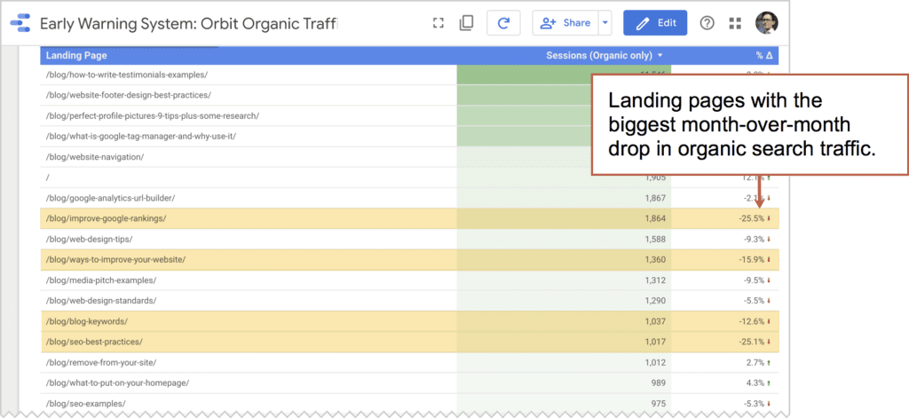
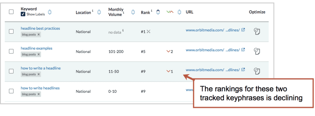
⚠  Analytics issues with organic traffic

Medium exactly matches organic

That’s how Google Analytics categorizes organic visitors in the Channels report.

But here’s the problem: Many of these visitors didn’t “discover” you in search at all. A lot of them were already brand-aware but forgot your web address. So they searched for your company name, saw you there in position #1 and clicked. Organic traffic! But not discovery.

So a lot of organic traffic is basically direct traffic.

You can check Google Search Console to see what percentage of your organic traffic were for branded (navigational) queries, as in your company name.

How to increase website traffic from search engines

  • Target phrases based on your own Domain Authority (here’s how)
  • Write very detailed pages that answer all the questions related to your topic. (One great, comprehensive page is better than lots of little pages.)
  • Go back and improve or rewrite older, almost-high-ranking pages (here’s how)

3. Social Media (Oars)

Stroke! Stroke! Stroke!

Social media traffic requires social media activity. Every time you pull those oars, you can move ahead a little bit. But if you stop, you won’t coast for long. You’ll soon be dead in the water.

Here are the defining traits of social media traffic:

Social media is unpredictable.

Even with consistent activity, you’re going to see big spikes and valleys in traffic patterns. Anyone know what’s going to trend tomorrow? Is anybody really good at “viral marketing?”

Social media isn’t just about traffic.

It’s about networking, PR, customer service, influencer marketing and listening. None of these are measured in Analytics. If your only reason for being active on social media is to attract visitors, you’re probably going to be disappointed.

(Some) social media can be delegated and/or automated.

You can’t replace yourself with a robot. But the types of social posts that drive traffic can certainly be scheduled or even automated.

There are basically three kinds of social media posts, and promotional social posts (sharing your own content to drive traffic) can be managed through tools (scheduling and automation tools like CoSchedule).

Here’s what social media traffic often looks like in Analytics. Spikey, isn’t it?

social media driven website traffic trend over time

⚠  Analytics issue with social traffic

Social Source Referral exactly matches Yes OR Medium matches regex ^(social|social-network|social-media|sm|social network|social media)$

That’s how Google Analytics knows what traffic to categorize as social media in the Channels report.

So “social media traffic” drastically undercounts traffic from social shares. Here’s why:

Something like 80% of all sharing (source) is not trackable as social shares. This traffic is called “dark social” because it’s not accurately tracked by Analytics. Dark social includes:

  • Clicks on links shared in text messages
  • Clicks on links shared in email messages
  • Clicks on links shared in messaging apps (What’s App, etc.)
  • Clicks on links shared in chat applications (Gchat, Slack, etc.)

Campaign tracking code with UTM parameters would fix the problem. But these are just random visitors copying and pasting URLs out of the address bar and into an app or an email. No tracking code. So most of these will get recorded as Direct traffic. More on that in a bit.

How to increase website traffic from social media

  • Sharing more content more often using every trick in the book! (here’s how)
  • Create short social videos that promote your content (here’s how)
  • Avoid Instagram

4. Email Marketing (Oars)

Sometimes there is no giant tech company, such as Google or Facebook, between you and your potential visitor. That’s email. It’s the one digital channel you own and you control.

You don’t own your social followers or search rankings, but you do own your email list.

Email is very spiky like social, but more consistent over time.

email website traffic trends

A rowing team gets results through repetition and coordination. The Olympic-level email marketers are just as consistent and organized. Here are the defining traits of an email marketing program:

Email marketing is about consistency
Email drives the cadence of a content strategy. It’s in sync with publishing calendars, event schedules, product launches.

Email marketing is about trust
The subscriber has control. You have a sender name and subject line. To win an email visitor, you need to first build enough trust through your content to get their email address, then build your reputation in the inbox to get opened and clicked.

Email gets a little easier
Results gradually improve as you build your email list and try new things. What’s working? Ever tried sending on a weekend? Changing the sender name? Doubling frequency?

⚠  Analytics issues: Email traffic

Medium exactly matches email

That’s how Google Analytics knows what traffic to categorize as email in the Channels report.

Simple, right? Yes, but only if you add tracking code. Add it to every inbound link in every email you send. It doesn’t take long. Follow these instructions and use this campaign URL builder.

How to increase website traffic from email

  • Make your sender name a person, not a company (here’s how)
  • Make sure your subject lines are “front loaded” with a specific promise (here’s how)
  • Send more email. But first, segment your email lists. Then send targeted content to targeted audience groups.

5. Direct Traffic (Current)

Just like the current under a boat, brand awareness drives traffic. They know the brand, they type the address into a browser, a direct traffic visitor arrives.

It’s probably the least discussed source of traffic, but it’s the most important. I asked my friends at SimilarWeb to share the traffic source estimates from the top online marketing companies. Direct traffic is the top traffic source by a lot, more than all other sources of traffic combined.

the share of website traffic sources from top marketing agencies

Probably most internet traffic is direct traffic, but people don’t talk about it much. There’s also a lot of confusion about it.

⚠  Analytics issues with Direct Traffic

Source exactly matches direct AND

Medium exactly matches (not set)

OR

Medium exactly matches (none)

That’s how Google Analytics knows what traffic to categorize as social media in the Channels report. Look at that last part. If there is no medium for the visit, it gets counted as direct!

So here’s the misunderstanding:

Direct traffic is supposedly from visitors who typed your address into their browser, but it’s actually all unknown sources of traffic. It’s direct traffic if the visitor…

  • Typed the URL into the address bar
  • Clicked a bookmarked or in browsing history
  • Clicked a link that wasn’t in a browser (PPT, PDF, QR code, app, etc.)
  • “Dark Social” shares (links in email apps, chat, slack, SMS text messages)
  • Incognito/private browsing mode
  • Clicked a link with bad campaign tracking code
  • Clicked from HTTPS to HTTP page

Any visit that isn’t from a search engine, social network or referring website and has no tracking code is lumped into direct traffic. A better name for it would be “Unknown traffic.”

There are ways to minimize these issues, but Google Analytics will never be 100% accurate. And that’s fine. We only need it to be accurate enough to help us make good marketing decisions.

How to increase direct traffic

This is a really interesting question that no one ever asks. I’ve never heard of anyone setting a goal to increase direct traffic. But why not, right?

Keep that current of direct visitors flowing by doing anything that builds brand awareness.

  • Offline advertising (TV, radio, print, outdoor)
  • Launch a useful tool
  • Do more networking, live events, presentations, podcasts or anything else where people talk to each other

6. Referral Traffic (current)

Here’s another source that people don’t talk about much, probably because it doesn’t align with a marketing activity, unlike search, social and email.

But like direct, it can be a consistent current under your boat.

Spikes usually come from news mentions and links on blog posts. Steady traffic often comes from directories.

referral website traffic trends

⚠  Analytics issues with Referral Traffic

Medium exactly matches referral

That’s how Google Analytics knows what traffic to categorize as social media in the Channels report.

That’s pretty straightforward. It should be all traffic from other non-search, non-social websites. But in reality, a lot gets caught in here, including a bit of search and a bit of social.

Check your Acquisition > All Traffic > Referrals report to see which sites are sending you visitors. You’re likely to see sources that are obviously email (mail.google.com) or search (uk.search.yahoo.com)

If you’d like to have more sites tracked as organic search sources, rather than referral sources, you can add them in the property settings.

Here you can see we’ve added Duck Duck Go and Ecosia …which apparently isn’t necessary anymore. They’re on the list of default search engines.

how to customize referral sources in google analytics

How to increase traffic from referral sources

  • Submit your site to all relevant directories (consider paid inclusion directories if they rank for your target phrases)
  • Write for other sites often (guest posting is a powerful approach to referral traffic)
  • Do something newsworthy! Think of link building as digital PR.

Diversity is good, Matey!

The best fishermen don’t always go to the same lake.

The best marketers don’t rely on one source of traffic.

Smart marketers diversify their traffic sources. It’s risky to rely too heavily on one traffic source, especially search and social. We can’t control what big tech companies do with their algorithms.

A friend of mine shared the breakdown of his default channel groupings. It’s impressive. None of his traffic sources make up more than 23% of his traffic. Take a look:

default channel groupings for website sources of traffic

Clearly he has a budget. In fact, he has a team dedicated to each channel. Must be nice to have that kind of fishing fleet!

Read next: What’s a good bounce rate? 

We looked at 500 Analytics accounts and found the average bounce rate for each of the online traffic sources. Here’s are the averages:

bounce-by-traffic-source

What about your site? Here you can see the average bounce rate for companies in your industry.

The post How to Understand Your Website Traffic Sources (Plus, 18 Tips to Increase Website Traffic) appeared first on Orbit Media Studios.

from Orbit Media Studios https://www.orbitmedia.com/blog/website-traffic-sources/
via IFTTT

Updating Content for SEO: How to Teach Your Old Blog New Tricks (plus, 3 examples with ranking data)

You wrote it years ago. It did well at the time. People liked it …they clicked and opened, commented and shared. But your readers moved on. And you never looked back.

Maybe it’s time to revisit that old blog post, update it and promote it again.

Updating old blog posts has been one of the most effective SEO strategies we’ve found.

We’re not the only ones.

For the past four years, we’ve included this question in our annual blogger survey: “Is it part of your strategy to update old articles?” Every year, more bloggers answer yes.

The bloggers that update past content are roughly 20% more likely to report “strong results” from content marketing. It’s a powerful strategy for any content marketing program.

Why is it so effective to update old articles?

There are at least five reasons to update an old post then write something new:

  1. The topic has been vetted because you have data from the first version
  2. It’s faster to make because some of the research is already done
  3. It’s higher quality because the updated article goes deeper into the topics
  4. It’s easier to promote in social media because you’ll know just who to share it with
  5. It may rank higher in search because the URL may already have backlinks and authority.

In other words, you’ll get better results with less effort. 

Here is our guide for updating content. We’ll show you which posts to revisit, how to update them and finally how to promote updated content. By the time you get to the examples below, it will already be obvious just now effective this content strategy can be.

Which blog posts should you update?

This works well if you’ve been blogging for a while. You have 100+ published articles. You’ve been checking Analytics and you know that some blog posts are getting 10x the results of others.

Our goal is to push more articles into that 10x results category. Certain types of articles have the best opportunities to become big winners:

  1. Articles that almost rank high. They could become traffic magnets with a little boost.
  2. Articles that are already high ranking traffic magnets, but at risk of being surpassed by rivals.
  3. Articles that created a lot of buzz when they were first published
  4. Research articles that have gone out of date

Two of these are specific SEO opportunities, easily discoverable through our 8-step content marketing audit.


erin balsa, THE PREDICTIVE INDEX

Start by doing a content audit. This will help you prioritize which pieces of content to update and optimize vs. which to leave alone, redirect or kill. I like to optimize blogs that have 10 or more backlinks going to them, blogs that are ranking (but not on page one) for high-value keywords, and blogs that get a ton of traffic but low time on page and low goal completions.”


Update articles that almost rank high

You probably have some older content that ranks high …on page two of Google. Find them, improve them and within a few days, they’ll likely bump up to page one of Google.

Unlike classic keyphrase research (find phrases, create content, check rankings) this is Google telling you what phrases to target (check rankings, find phrases, improve content). It’s backwards and way more effective.

The data is in your Google Search Console (GSC) reports. You can access this report directly in GSC, in Google Analytics (if you connected them) or in any rank tracking reports in your SEO tool of choice.

  1. In Analytics, go to the Acquisition > Search Console > Queries report.
  2. Choose a date range that gives you enough data for analysis, usually several months.
  3. Create an advanced filter to show only queries for which you don’t already rank high:
    Include queries for which the average position in search results is greater than 10. Here’s what it will look like.

The report will now show you the best SEO opportunities, each of which you can capture by updating the associated page.

Caution ⚠  Before updating a page, find all the phrases that page ranks for. You need to know if it’s already ranking even higher for other phrases. You don’t want to accidentally de-optimize it by making it less relevant for other high ranking phrases. We’re here to improve quality and rankings, not change keyword targeting.

Update articles that rank well but are starting to slip

This is the second big SEO opportunity. There are two ways to find them. The first is traffic. Just check changes in traffic over time to any page in the Behavior > Site Content > All Pages report.

That’s fine, but not ideal. That traffic may not be from search and those pages aren’t necessarily landing pages. Far better to go to Behavior > Site Content > Landing Pages report, add a segment to see just Organic Traffic and then compare traffic to a previous period.

If you like building reports, you can set this up in Google Data Studio, which is easier to scan. I called my report an “Early Warning System.” It shows which landing pages have declining traffic from search month-over-month.

Another way to monitor changes in rankings is with SEO software, such as SEMrush or Moz. These aren’t free, but they’ll give you a report that you won’t find in Analytics or Search Console: changes in rankings for specific keywords over time. 

Here’s what it looks like:

Now that we know exactly which articles need a little love, and which posts to update for SEO impact it’s time to start improving them.

How to update old blog posts for SEO and higher rankings

There are two approaches to updating blog articles, one small and one big. Some bloggers use a light touch and simply update the headline and a few sections. Others go big and actually rewrite the entire post.


We typically take the second approach. Go big and completely overhaul the article.

To take the blog post to the next level, we step back and look at the topic again.

  • Is there new research on this topic?
  • Has our thinking or approach changed?
  • Do we have new examples to include?
  • Which visuals could best support this content?
  • What influencers should we collaborate with?

In the end, some sentences and sections will be kept, but it’s really a rewrite. The process for blogging is similar to that of any new article, from researching the keyphrase research to designing the final image. Here’s our typical process looks like minute-by-minute.

For us, updating content is time intensive. Often the new version takes more time to write than the original.

What is URL Recycling?

By writing a new article where an old article used to live, you are basically recycling the original URL. If that URL has been linked to from other websites, you are leveraging the existing authority of that page, which could be substantial.

You can check to see if a page has been linked to using Google Search Console, which shows you the number of domains that link to a given page.

Or you can use SEO software to count the links and estimate the authority of that page. This should give you a better idea of the ranking potential.

Either way, by reusing an old URL, you can target keyphrases that would otherwise be out of reach for a new post. The URL is “pre-authorized” to rank well if it has been linked to by other websites. The foundation is in place to build higher.

With this in mind, I can imagine a two-step SEO strategy, based on building then recycling URLs.

  1. Publish short-form content that is likely to attract links (infographics, strong opinion, quick research pieces). Don’t worry too much about on-page SEO.
  2. After the URL has attracted links (could be months or a year later) recycle it by writing a long-form keyphrase-focused article at that same address.

Now the page will have both authority and relevance, the two main search ranking factors.

This strategy might be slow (literally 1+ years) but allows the SEO to target impossible-to-rank-for phrases. See example #2 below.

URL best practices for bloggers

Once you start recycling URLs, you’ll quickly realize that all new URLs should be created with this approach in mind. Make these your new rules for making URLs that are easy to reuse later:

Never put a number in a URL
Example: http://www.website.com/blog/7-url-best-practices

…that’s bad because when update it next year, it may have 12 best practices. If you recycle the URL, they’ll be a mismatch with the title and header.

Never put a format in a URL
Example: http://www.website.com/blog/url-best-practices-infographic

…that’s bad because you may want to publish an article on this URL later. It may not mostly be an infographic (or webinar or ebook) when you update it next year.

Every article’s URL should be short, simple and descriptive. No numbers. No formats.

This took me years to learn.

How to promote updated blog posts

Rewritten articles have special opportunities that fresh content does not. There are specific content promotion tactics for every channel: search, social, email and influencer marketing.

1. SEO: The keyphrase research is already done
You may have selected the article based on keyphrase performance. We showed this process above. You can use that same analysis to do semantic SEO, incorporating all of the related phrases and subtopics into the new piece.

2. Social: Share with people who shared it last time
Using a paid tool such as Buzzsumo, you can look up the “top shares” of the original version. Scan through, find some good ones, then reach out. Or tag them when you share again.

3. Email: Data-informed subject lines
Social is high-data, low-engagement. Email is low-data, high-engagement. But you can leverage social data to guide email marketing decisions. Find the social posts of the article that were engaged with the most (using Buzzsumo or your social media management tool) and use those words in the email subject line.

4. Influencer Marketing for SEO
Find articles that linked to the original (using SEMrush, Moz, Buzzsumo, etc.) and then let the author know that the article has been updated. They may cover it again, especially if the new version includes updated research. (Related: 29 Ways to Promotee Original Research)

5. Influencer Marketing for Collaboration
The outreach to influencers is easier this time around: “This piece was a big hit, so we’ve decided to revisit it…” or “I’m hoping you’ll contribute to one of our most successful articles…”

Definitely don’t miss the opportunity to collaborate with influencers when updating your content. They can improve the content quality, social reach and backlinks. They also grow your network and make your job a lot more fun. Making friends is the best part of life.

3 examples of updated content and SEO performance

In the examples here, I’ll show you the fruits of the labor. Each is like a little story with ups and downs..

1. “Byline takeover” rewriting an old guest post

Back in April 2013, a friend wrote an article for us about the basics of SEO. A few weeks later, I noticed that it was ranking for “SEO basics” so I started tracking the phrase.

Over the next few years, we watched it slide into oblivion.

It went from 200+ visits per month to less than 20. Rather than leave it there in the abyss (or asking my friend to go write it again) I recycled the URL and write a new post at the same address.

The new post went live in 2018. Almost immediately the rankings recovered as did the traffic. It’s ranked on page one ever since …although it’s since starting to slide again.

Here you can see the SEO and traffic results. I’ve overlaid the rankings with the pageviews so you can see the correlation.

And here’s the before and after for the content and engagement, showing just how much bigger the updated blog post is.


Bonus! I recorded a video version of me presenting the content and added it to the top of the post. This is part of our YouTube content strategy and that video has attracted 2,800+ views.

The byline takeover works the other way too. When our 2015 article about social media automation went out of date (and rankings dropped) we reach out to our friends at CoSchedule. Ben Sailer rewrote it on the recycled URL and rankings recovered for the next year. Thanks, Ben!

2. “Second chances” how to win for an impossible phrase

I remember thinking “I have no chance at this keyphrase.” I was doing keyphrase research for a new article and I was right. I had no chance.

The article was about how to write headlines. It’s an important topic that I felt strongly about. I’d written hundreds of headlines and I wanted to share what I’d learned.

But the high ranking pages were written by the content marketing greats. Their content was deep, concise and practical. Their articles all had lots of links and high Page Authority.

But I decided to write my article anyway. There’s more to life than search, right?

Even though the phrase was out of reach, I optimized the post for “how to write headlines” by simply incorporating it into the title, header, body text and URL. It went live in September 2014.

It didn’t rank. No surprise.

But I kept promoting the article for years.

  • I mentioned it in presentations
  • We kept it in social media rotation
  • I wrote guest posts on the topic and references the article
  • I talked about it on podcasts
  • I referenced the diagram from the post in contributor quotes whenever possible

Referencing images in contributions is one powerful example of how images can affect SEO. Here’s the diagram from that post. Nice right?

cost-benefit of a headline

Eventually, the article began to age. Over time, we found new research, we had new ideas and we earned more experience writing another 1000+ headlines. So in May 2019 we updated the article.

But this time, the URL had an advantage. 100+ linking domains gave it a Page Authority of 45. That target keyphrase didn’t seem so out of reach this time around.

The rewrite wasn’t longer, but it definitely was more complete. We recorded a video for it, added those diagrams and collected new contributor quotes.

The results? The average time on page doubled. And it now consistently ranks at the bottom of page one of Google. We are thrilled.

Here are the rankings and traffic together. The 200+ visits per month might not seem like much, but it’s an honor to rank among the other great articles on the topic.

Since the rewrite, the post has started attracting more links, probably because it’s now more visible. Each link improves it’s ranking potential, while also strengthening the authority of our entire domain.

…and we’re not done yet. Maybe the next version will crack the top five search results. Never give up! 🙌

Could it actually work to write an article a third time? Here’s your answer:

3. “Never surrender” …write, rewrite then rewrite again

In June 2012, we published an article with tips for promoting content. Keyphrase research quickly showed that “content promotion” was a very competitive phrase, so I used the longer, less competitive phrase in the title, header and URL “content promotion strategies”

It actually ranked well for both phrases, attracting 150-250 visits per month. But the rankings gradually declined and it got very little traffic for several years. So I finally sat down and rewrote it in August 2016, adding all of the content promotion tricks I’d learned since 2012.

The headline changed from “33 ways to promote content” to “50 ways to drive traffic” and the rankings and traffic soared. So did the average time on page (see below).

The article enjoyed three years of high rankings and 300-500 visits per month, always performing a bit better for the longer, less competitive phrase. But eventually, new (and better) articles were written and began to push both rankings down.

But we didn’t give up.

We re-rewrote it in May 2020, this time adding more tactics and more depth. This post is now 76 ways to promote content (did I miss anything?) and the rankings have partly recovered. Here’s the timeline of rankings and traffic since 2012.

And here you can see the evolution of the article with the headlines, length and assets. Again, we’re showing a few behavior metrics so you can see how the content attributes correlate with engagement.

You don’t need 1000 articles. You need 100 great articles.

Since 2016, when we first discovered the value of updating content for SEO, it’s become central to our content strategy. Currently, around 20% of our articles are actually rewrites of older articles.

In fact, the article you’re reading now was originally published five years ago. But this new one is better.

Altogether, there are at least 36 posts on this blog that have been rewritten at least once. And our annual blogger research is in its seventh year and it’s always published on the same URL. Even our content marketing handbook is in its fifth edition.

Commit to keeping your content current

Of course, it’s important to publish articles and put new URLs and keywords into the world.

But you’ll get faster results by going back and keep those top performers updated. You’ll capture more search volume from the same phrases with less effort.


Aaron Orendorff, iconiContent

There are two ways to breathe new life into old posts. First, use the old post as a base and create a fresh, stand-alone article. I did this recently for my most popular post on Content Marketing Institute: from the original with 2k words and 11 points to the update with 4k words, 19 points, and a downloadable PDF.

Second, simply update your old posts themselves and keep the original URL. I do this on my site, and it’s one of the first low-hanging fruits I identify with clients to minimize my workload and maximize their existing SEO.”


Here are a few final considerations…

  • If your blog post doesn’t rank, maybe that’s because you’ve only written it once.
    This is what the search engines want you to do: create an amazing piece of content.
  • If your content is search optimized, you’ve basically committed to this strategy already.
    Your search optimized content has durable visibility. People are still reading it. Don’t let them down. Especially if you don’t have dates in your blog template (we don’t)
  • If you’re about to write a new article, first look to see if you can recycle an old URL.
    If it’s a URL that has been linked to, it will have a natural advantage in search.

Now go teach your old blog new tricks!

The post Updating Content for SEO: How to Teach Your Old Blog New Tricks (plus, 3 examples with ranking data) appeared first on Orbit Media Studios.

from Orbit Media Studios https://www.orbitmedia.com/blog/update-old-blog-posts/
via IFTTT

Multivariate and A/B Testing – A crucial component to website success

If you are confused as to whether you should conduct multivariate testing or split testing on your emails, web pages, popups, and opt-in forms, you are not alone.

When starting out, many marketers struggle to understand the difference between these two types of conversion optimization tests.

Much of the advice online tells you to perform tests and keep on testing and optimizing. But, it’s not always clear what types of tests you should be running, or where you should run them.

This article will help you understand the differences between A/B and multivariate testing. You’ll discover their pros and cons, where it’s appropriate to use each type of test, and how to perform the tests in order to get maximum conversions from your marketing strategies.

What is multivariate testing?

In order to help you understand the difference between multivariate and A/B testing, we’ll first take a look at the definition of each type of test, as well as the methodology, common uses, pros, and cons of each testing method.

Multivariate testing involves testing multiple combinations of elements at one time. In other words, you have the ability to change several different items on a single page, so that one version of the page might look radically different from the other one.

Traffic to the test page is divided among the different design versions with the purpose of measuring how effective each design combination is in helping to achieve the ultimate goal.

With this type of testing, you’re using the same core mechanisms that A/B testing uses, but while comparing more variables.

This reveals more detailed information about the way these different variables interact with each other.

Source

Types of multivariate testing

Below is a quick rundown of some of the more commonly used types of multivariate testing that you can perform on your web pages, emails, opt-ins, etc.

  • Full Factorial Testing: This tests all possible combinations of the page elements until a clear winner is found. It’s the most preferred type of MVT testing, and it requires a large amount of traffic that is then distributed evenly among the different variations.
  • Fractional/Partial Factorial Testing: As suggested by the name, this type of testing only analyzes a fraction of the possible combinations. Statistical mathematical calculations are then done to find the best converting variations from the rest of the versions.
  • Adaptive Multivariate Testing: A new approach to multivariate testing, adaptive multivariate testing analyzes the real-time response of webpage visitors to find the version with the best-converting combination of elements.

Advantages of multivariate testing

Multivariate testing is an extremely powerful conversion optimization tool. It’s great for helping you to target redesign efforts to the different page elements where they are likely to have the biggest impact.

This is particularly useful if you’re designing landing page campaigns as you can collect data about the impact of specific element designs and apply that same information to future campaigns. This has been proven to be effective even if the element is in a completely different context.

Here are some additional benefits of using multivariate testing:

  1. Multivariate testing offers faster results than running split tests since you can change and analyze multiple elements on a single page.
  2. It allows you to easily determine each variable’s contribution to the measured gains.
  3. With MVT testing, you can measure interaction effects between multiple supposedly independent elements, such as visual illustration and page title, for instance.

Limitations of multivariate testing

This type of conversion optimization testing also comes with some disadvantages.

For instance, let’s say that you have a great interest in a particular topic and decide you want to create a blog.  Multivariate testing won’t work in the beginning because you’ll have so few visitors. Personally, I feel you need to have about 50,000 monthly pageviews on a website or blog before you can even consider multivariate testing because of the number of combinations that need to be tested.

In addition to that, the more page element combinations you test, the more time you’ll need to conduct the test.

What is A/B testing?

A/B testing (also referred to as split testing), is a method of optimization that involves using live traffic to test two different versions of a page in order to find the one with the best conversion rate.

With this type of conversion testing, visitors to a web page are funneled into either version ‘A’ or version ‘B’ of the same page.

Source

A comparison is made by tracking how the visitors interact with the page that is shown to them. For example, if you created an e-learning product and drove traffic to the page, what buttons do they click? What videos do they watch? Do they sign up for the product, and so on.

With this information, it’s then easy to determine which page version is the most effective.

In short, split testing is all about testing a control (the original page) against a variation (the one element that you change) to see how the changes vary from one page to the next. You can change elements like:

  • Headlines
  • Graphics
  • Videos
  • Button
  • Colors
  • Offers
  • Fonts
  • Layouts
  • Call to action text
  • … and just about anything else you can think of.

To conduct a split test, you simply split your traffic evenly. 50% of the page visitors go to the original version and the other 50% are shown the new one.

Types of A/B testing

Another version of A/B testing is called A/B/n testing. This is where you test many different variations of the same element, dividing the traffic among them evenly.

For example, you could test five different versions of your CTA button. The traffic to the page would be split into five, with 20% of the total seeing each page variation.

Advantages of A/B testing

As with multivariate testing, this widely used testing method has its advantages.

  1. A/B testing is simple in design and concept, yet it’s powerful in providing you with extremely reliable insights on the page versions that convert best.
  2. The small number of tracked variables means that A/B tests can deliver results quickly as they don’t need a large amount of traffic to get accurate data. This is ideal for sites that don’t have large numbers of daily visitors.
  3. A/B testing is quick and easy to interpret, and even bigger sites commonly use it as their primary means of testing as it allows them to run test cycles one after the other, instead of conducting complex multivariate tests.

Limitations of A/B testing

Using A/B testing as a conversion optimization tool also comes with a few drawbacks. For instance, with this type of testing, you cannot tell how the different page elements interact with one another.

You may decide to alter the text on your call to action button, but there could be something else on that particular page that has an impact on how visitors respond to it. You won’t be able to measure that with split testing.

Multivariate and A/B testing use cases

In this section, we’ll take a look at some use cases of A/B testing and multivariate testing, as well as some examples of how making use of these strategies in your business can lead to outstanding results.

Common uses for A/B testing

This is the least complex way of testing and evaluating any page design element, and it’s useful in a wide range of situations:

You can use A/B testing as an optimization option to find the best page where only one element is in question.

For example, a dentist’s office running an A/B test on a page on their site might find that 75% more users sign up for their newsletter when shown a sign held up by a cartoon tooth than when shown a sign held by an actual dentist.

When A/B testing is conducted in this way, you can even add a third, fourth, or fifth page. This would then be called an A/B/n test, and the traffic would have to be apportioned evenly to all pages.

These same types of tests can be done on social media as well.  On Facebook for example, a dentist could test two different ads with the exact same image, and simply change the text on them.

After they have a statistically significant sample size of data, they could then use Facebook analytics tools to see what performed the best and use that ad indefinitely, or until another test finds a better variation.

Another common use for A/B testing is to test different landing page designs against one another.

For instance, you could use it to analyze the current version of your business’s homepage, which might include elements like text, images, video, and a call to action.

In the new version of the homepage, you might get rid of most of the text, but include a bar at the top for advertising your latest products. After funneling enough visitors to both pages, you compare the number of clicks on the different versions of the call to action.

With this testing method, you must note that although multiple design elements are altered, you’re only tracking the impact of the page design as a whole on the specific goals for that business page – not the individual elements.

Common uses for multivariate testing

When it comes to multivariate testing, the most commonly cited use for this method of testing is on a page with several elements that are up for debate.

For instance, you could have a page with great header text, a signup form, and a footer. You might run a multivariate test, rather than creating a very different page (as in the A/B test described above).

So, if you’re looking to understand how to price your service, you could add two signup forms of different lengths, two footers, and three different pricing plans. Next, you would drive traffic to all the possible combinations of these elements (full fractional testing).

Important Note: Keep in mind that the more variations that you have to test, the more traffic you’ll need, and the longer it’s going to take to get meaningful data from your multivariate test. That’s why this form of conversion optimization testing is typically recommended for websites with substantial amounts of daily traffic.

After you’ve run the test, you can then compare the variables on the different page variations to each other, as well as to their performance in relation to other versions of the multivariate test.

You will then have a clear picture of the page that offers the best results, and also the specific elements that are responsible for the improved performance.

For example, changing the footer of the page may have very little impact on the page’s performance, while changing the text on the call to action button may have a big impact.

The last example of multivariate testing that I can think of has to do with YouTube.  I’ve been focused on my own YouTube channel since the beginning of 2020 and I am constantly testing different variables to see how well my videos are received by both my audience, and the YouTube algorithm

Some of the things that I’ve tested on YouTube are the titles of my videos, video covers, and even the editing of the YouTube videos as a whole.  In all of these different tests, I’ve found ways to not only increase subscribers, but also increase viewer retention to have more success with the channel.

Deciding what works best for you

Both multivariate testing and split testing have their unique pros and cons. The type of testing you choose depends on your business’s needs.

Are you looking for a way to refine your pages for improved conversions? If so, then A/B testing is the way to go.

Do you need to test complete new pages after a massive website redesign? Multivariate testing will reveal all the information you need to know.

You can choose one or the other depending on your needs. and you can even use both to get the best possible results from your conversion rate optimization efforts:

  • A/B tests are quick and offer bigger gains even for websites with small traffic numbers.
  • Multivariate tests give you an overview of many different changes that you can then split test to fine-tune the individual elements.

You can also use A/B testing to find the best page layout, and multivariate testing to tweak the interaction between the different elements on the page.

How effective are these conversion optimization tests?

If you’re wondering if these scientific methods of optimizing design are really effective, look no further than these three studies:

1. WebFx – Ocean City New Jersey

One company, Ocean City, wanted to add a fresh new look to their website that would emphasize their business’s family atmosphere.

After the redesign, WebFx conducted thorough conversion testing and was able to increase the overall website visits by 87%. The bounce rate for this page decreased by 11%, and conversions shot up by 40%.

This is just a sample of the power of multivariate testing for helping you achieve your business objectives.

2. Unbounce – Dustin Sparks

This case study involved a control page that was converting at just 3.12%. Through effective planning, a single split test was used to increase conversions on this page by 336%. This is what Dustin Sparks called ‘apples to oranges’ split testing.

Depending on the industry or niche you’re in, a 3.12% conversion rate could be good, bad, or it could be average.

However, by running the control version against a variation, this company was able to record amazing results. Those are the kinds of results a simple A/B test can bring to your B2B or B2C business.

3. VWO – Provident Hotels and Resorts

A multivariate test was performed by VWO with an aim to help Provident Hotels and Resorts increase the number of clicks on their call to action buttons.

The testing team decided to optimize the combination of CTA button text and form title by analyzing the following variations:

The result? After running the test over a period of one month, using equal amounts of traffic to each of the 12 pages, it was found that the final combination recorded an impressive 9.1% improvement in the conversion rate.

After just one MVT test, they found the page version that instigated the most website visitors to check for the availability and rates of rooms.

As you can see from these three case studies, A/B and multivariate tests are extremely effective for helping you optimize the design of your web pages.

Though collecting information is just the start of your digital customer life cycle, optimizing this process will increase your lead count which will inevitably lead to higher sales and revenue once optimized.

If you’re eager to get started with your own tests, here are three affordable tools that you can use to conduct conversion optimization analysis.

3 top A/B testing and multivariate testing tools

The three tools recommended below are some of the best options available to marketers and business owners looking to conduct effective conversion tests.

But, if you just want some quick recommendations, the information below will help.

1. Google Optimize with Google Analytics

This is a free tool that you can use to start A/B testing and improving the different pages on your website.

The software has a user-friendly interface, and you will be able to set up your first test in just a few minutes thanks to the visual editor.

Google Optimize will allow you to better optimize your customer journey even if your business is new and you’re not yet receiving large amounts of web traffic.

Designed to work with Google Analytics, Google Ads, Firebase, and more, this free tool is one that every business can benefit greatly from.

2. Unbounce

Unbounce offers both A/B and multivariate testing to help you optimize all your website’s pages.

This optimization tool is different in that it also offers you the ability to create landing pages and then test them. You can use their beautifully designed templates that are proven to convert more.

If you’re focused on turning your traffic into revenue in the quickest and most effective way, then this software can help you get there with easy to implement A/B and multivariate tests.

Unbounce offers solutions for SaaS, Agencies, and eCommerce. No matter what type of business you have, this CRO tool can help you achieve outstanding results in the quickest time possible.

3. VWO

Used to A/B and multivariate test web pages on a larger scale, VWO is a tool that will help your business identify any roadblocks or possible friction points on any page, develop a hypothesis, and then test an infinite combination of elements to find the best-performing variation.

VWO’s testing tool offers an affordable way to accelerate your website conversions with all types of testing.

It also allows you to optimize your customer experience by helping you run experiments to understand their behavior and fix leaks and gaps where engagement drops or visitors get stuck.

This is undoubtedly the best tool for companies looking to drive explosive growth by getting the most out of their CRO process.

Summary

By now, it’s clear that A/B testing and multivariate testing are versatile tools that are crucial for your business.

While these two tools may have some differences, don’t think of them as opposites, but rather as two immensely powerful testing methods that complement each other to help you optimize every page on your site.

Keep in mind that these conversion optimization tests are not things that you can simply do once on your site and be done. Optimization is an ongoing process that you’ll need to invest a lot of time and effort into if you want to see great results.

The good news is that the payoff of all that work can be phenomenal. Once you get things working the way you want them to, you’ll be able to convert ever-growing portions of your web traffic into leads and customers.

So, go ahead and use the information in this article to improve your page designs and help your business experience phenomenal growth.

The post Multivariate and A/B Testing – A crucial component to website success appeared first on Orbit Media Studios.

from Orbit Media Studios https://www.orbitmedia.com/blog/multivariate-ab-testing/
via IFTTT

Beginner’s Guide to Technical SEO: Avoid These (Simple) Website Mistakes that Are Killing Your Rankings (w/ Checklist)

SEO is one of the best — if not the best — sources of organic traffic your business can get.

In fact, around 84,898 Google searches are made every second, bringing plenty of opportunities for businesses like yours to get organic traffic on their website.

This is why almost every business wants to tackle SEO. And the reason why you’re probably investing tons of time creating blog posts, doing keyword research, and building links (or buying links).

Unfortunately, this opens the door for a lot of potential SEO mistakes that non-technical people may be falling into without even noticing.

Because, after all, SEO requires some technical knowledge.

But don’t worry, I’m not here to teach you HTML. Instead, we’re going to focus on the most common technical SEO mistakes made by beginners and how to fix them with ease.

So if reading this alleviates you, keep scrolling.

How to identify technical SEO issues

The best way to identify problems is by conducting an SEO audit. An SEO audit allows you to get into the deepest side of your site and find those little tiny errors that may be hindering your Google rankings.

And in our new normal of remote virtual workers spending more time online, this is something you can no longer afford to miss out on.

To do this, you can simply use an SEO tool like Ubersuggest, put your site URL, and get a report of errors and warnings that are hurting your SEO potential.

It should look similar to this:

screencapture-app-neilpatel-en-seo-analyzer-site-audit

SOURCE: OrbitMedia’s site audit on Ubersuggest

Chances are that you’ve got many website issues that are keeping you from ranking higher, and thus, you need to address these problems as soon as possible.

An automatic SEO audit is great and all. But if you want a more sophisticated SEO audit, using software won’t be enough. You’ll need to check things manually.

That’s why we’re going to go through the most common SEO mistakes, and the easiest ways to fix them.

I hope you got enough sleep last night and you’re ready to roll because this post is packed with actionable information you can start using right away.

Now that you know how to ID technical SEO issues, let’s dive into those (simple) SEO mistakes that are killing your rankings (and how to avoid them).

Mistake #1: Your sitemap and robots.txt aren’t properly configured

Your sitemap.xml and robot.txt files are essential so Google can crawl your website and index your pages.

These files are responsible for telling Google what and how to crawl your website and make it easy for crawlers to understand its structure.

When these files are misplaced and not well-configured, you’ll get into crawl problems. And remember, Google can’t index and rank your pages if it can’t crawl it.

To make sure that you’re not having any issues with this, first:

1) Make sure that your robot.txt isn’t blocking your site.

The robots.txt file tells the crawl robots where they’re allowed to go to and where they shouldn’t go.

Head over your robots.txt by going to “www.yoursite.com/robots.txt” and check if it isn’t preventing the crawlers to look at your pages.

robots-txt-file-example

Source

If it shows a “/” after “disallow:” like the image above, then it is blocking your site from being crawled and you need to remove the slash.

If your site is a bit more complicated than that, you’ll need to manage the folders you’re allowing and disallowing. Make sure you’re not unintentionally blocking valuable pages from being crawled.

2) Manage your “crawl budget”

According to Google, crawl robots have a “crawl rate limit” for each site. So it is a good practice to manage your “crawl budget” based on the “crawl rate limit” that Google puts on your site.

If your website has a lot of low-quality pages and folders that you don’t need to index, then it is worth blocking those pages from being crawled, so you can optimize the “crawlability” of your website and see more rankings faster.

3) Verify that your sitemap.xml is submitted

The XML sitemap shows the most valuable pages of your website and helps crawlers to better understand its link structure.

If your website is missing a sitemap, these Google’s crawl robots will have a hard time checking your site, thus affecting your SEO performance.

To make sure everything is right, use Google search console and look for the sitemap:

sitemap-search-console

Check if:

  • The sitemap is located in the root directory.
  • The XML sitemap is listed in the robots.txt file.
  • The most valuable pages are included in the sitemap.
  • The sitemap structure is optimized for indexing.

As a final note. If you’re using WordPress your robots.txt file will probably look like this:

This just means it is blocking access to your WordPress folders and allowing the content that’s coming from it.

Mistake #2: Link structure issues

Having a healthy link structure on your website improves both searchability and user experience.

But it’s a common mistake to change a page’s permalink and forget about updating the rest of the pages that are linking to that specific page.

This won’t only bring a 404 error to your user’s screen but also keep your page from being found by crawl robots.

To prevent this issue from happening, you need to keep an eye on your link structure. Following these steps:

1) Search for both internal and external broken links in your website

Having broken links in your site will affect your SEO performance negatively, that’s for sure.

And this isn’t something 100% under your control as a website you’re linking to can potentially change its URL without letting you know. Which… can give you this headache.

To avoid this, make an audit and spot every broken link and replace them with something more valuable to the user.

You can either use Google search console, Yoast, or a tool like Broken Link Check to find broken links.

broken-link-check-report

Source

From here, you’ll be able to fix this issue relatively quickly and easily.

2) Make sure your site’s crawl depth doesn’t surpass three clicks

Crawl depth refers to the number of clicks it takes to get to a certain page from the homepage.

As a standard, very few pages should surpass the 3 clicks threshold.

This doesn’t mean you should link everything right from the homepage, as that would hurt user experience and, overall, your customer relationship.

So, in order to leverage your link structure, take advantage of category sections, and organize your content in a way that’s easy for the user to navigate and reach the majority of your pages.

Just make sure you’re not leaving any orphan page behind.

3) Find orphan pages in your website

Orphan pages aren’t internally linked from anywhere.

Google sees orphan pages as something not worth indexing. So if you’ve been publishing content without taking care of internal linking, you probably have some orphan pages around that you need to attend to.

You can use an SEO tool like Ryte to spot orphan pages. And from there, start adding links to complement your website structure, to make it more polished and attractive for Google.

Mistake #3: Duplicate content

Duplicate content is a great source of risk for your rankings.

And with good reason, since Google needs to penalize duplicate content for plagiarism issues and to encourage good user experience.

It can cause you to compete with yourself and confuse Google in the process.

Common sources of duplicate content include printable pages, Http versions of your site, author pages, and even two pages sharing the same H1 tags, title tags, and meta descriptions.

Even when a product page can be found in different categories, it may show two different URLs, and Google can interpret that as duplicate content.

To address this issue, ask yourself:

  • Do the URLs have parameters or tracking codes?
  • Do completely different URLs have identical content? This often happens with product pages as I said above.
  • Do different pages have the same meta tags (meta title, meta description)? If so, learn to write SEO-friendly meta tags for your content, and use them to differentiate your content in the SERP.
  • Copy a section of the content in quotes, and enter it in the Google Search. Is the content appearing elsewhere else in your domain (or even subdomains)?
  • Have you deleted any duplicate content already? If so, you probably need to submit a request to Google to remove the content.
  • Do you have printable versions of specific pages?

When you spot duplicate content, you can either delete old content, tag the most important version as canonical (with “rel=canonical”), or use 301 redirect to, for example, redirect the Http version of a page to its https version.

Mistake #4: “Noindex” tag problem

Meta robot tags like “Nofollow” are responsible for telling Google crawlers whether a link is worth considering or not.

And it hurts your ranking when you’re accidentally leaving Nofollow tags over your website, hurting your site’s “indexability” in the process.

To solve this, identify every page with the “Noindex, Nofollow” tag.

And then, check to make sure you’re not blocking any valuable content from being ranked.

If you are, remove them. And replace for the default “all” or “index, follow”.

If there are some pages that need the Noindex command then leave them as they are (like category pages, shopping carts, thank you pages, etc…).

However, take notice that too much use of “noindex” can directly reduce the overall crawl rate of your site.

Mistake #5: Your site isn’t fast enough

Site speed is one of the top Google’s ranking factors out there.

And the reason for it is quite evident. As the slower your site, the more likely your visitors are to bounce back to the SERP and click on a better, faster page — and Google penalizes that.

So having a fast loading website is now a requirement for SEO.

To keep this on-check, follow this simple procedure:

1) Run a page speed test

Google has its own tool to measure site speed, letting you know how optimized your site is.

Alternatively, you can use something like Pingdom or GTmetrix if you want extra input.

These tools will tell you what are the biggest issues with your pages, and guide you in the optimization process by throwing out a report like this one:

gtmetrix-reports-kevdaniel-com-CeglIh94

As illustrated in this screenshot, it will show your site’s performance and the factors that are keeping it from getting faster (like image compression and scaling in this specific example).

2) Analyze the report and optimize as much as you can

Next, you need to start shaping up your site to make it faster.

3 seconds or less is the standard load time. So check the report to see what the major factors are affecting your site load speed and fix them.

Some key practices to keep your load speed optimized include:

  • Optimizing image size (among other image factors affecting SEO, especially for infographics)
  • Getting a fast WordPress theme
  • Replacing plugins that are taking too much time to load
  • Compressing JavaScript, HTML, and CSS files, and Gzip
  • Leveraging caching to make your site more efficient

A plugin like W3 Total Cache can help you do at least half of this optimizing work if you use the right caching settings. But you should still keep the habit of tracking your site performance to avoid messy situations.

Mistake #6: Your website isn’t responsive

Since 2017, Google has been taking mobile searches into consideration, taking responsive design as a ranking factor.

This means your website needs to be optimized for mobile. Otherwise, Google assumes your website is low-quality.

For this, run a test and check how mobile-friendly your homepage is. It should look like this:

search-google-test-mobile-friendly

Who better than Google to know if your website is mobile-friendly enough for SEO?

Here are some errors you can get from the report:

  • Touch elements are too close and you need to re-define the layout.
  • Fonts are too small and you need to go back to your CSS file and re-adjust.
  • In the worst scenario, you don’t have the meta viewport tag. If this is the case, you’ll need to include this line in your page, so your site can respond to the user’s device:

<meta name=”viewport” content=”width=device-width, initial-scale=1″>

You can also navigate your website from your own phone and check if there are some malformed elements and images with awkward resolutions.

Mistake #7: Too many 301 redirect chains

301 redirect chains aren’t good for SEO and you lose link equity for every step in the chain.

Redirects are great to eliminate duplicate content issues and to remove old content from the indexing, so you’ll find yourself using redirects a lot.

But be aware of not generating any chains, since Google suggests not to follow redirect chains with multiple steps, and they’re very likely to rate your target page lower for this.

To fix this, edit your redirects so instead of following this pattern:

URL 1 —-> URL 2 —> Target URL

It follows something like this:

URL 1 —-> Target URL

URL 2 —-> Target URL

You can use a software like Screaming Frog Spider SEO to spot your redirect chains and fix them right off the bat.

Avoid costly mistakes using this checklist

Now, let’s wrap up everything into a checklist.

Use this checklist to ensure that you’ve got everything right and optimized in your website:

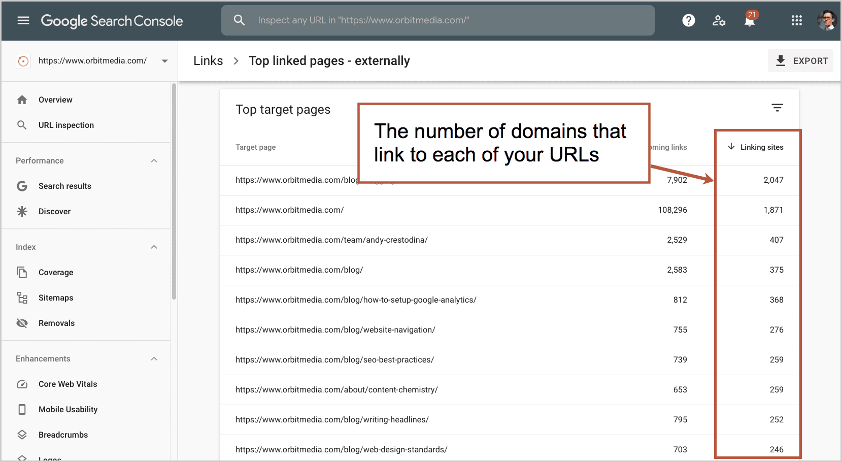
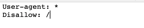
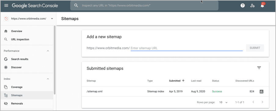
✔ Sitemap XML and Robots.txt properly configured. Check these files and make sure that they’re not preventing your website from being successfully crawled.

✔ Broken links fixed. Clean your website replacing every broken link for a better, more valuable one.

✔ Optimized crawl depth. Organize your content categories and try to keep crawl depth under 3 clicks

✔ Reduced orphan pages. Find every orphan page, and if they’re valuable, include them in your link structure.

✔ Duplicate content issues fixed. Look for every threatening duplicate content and take appropriate measures.

✔ No misplaced “Noindex” tags. Make sure you’re not accidentally telling Google to not index some of your valuable pages.

✔ Load speed optimized. Check your load speed, and look for ways to optimize even further.

✔ Responsive, mobile-friendly website. Test and navigate your website, and look for ways to improve user experience for mobile users.

✔ 301 redirect issues fixed. Break as many unnecessary redirect chains as you can.

Technical SEO doesn’t have to be a struggle

At first, technical SEO can be overwhelming.

But as you’ve seen, it doesn’t have to be as daunting as it seems if you start to understand the reason behind its quirks (you may even start to enjoy it).

If you avoid making these mistakes while applying the best practices we covered, your website will:

  • Become easy to find and crawl for Google
  • Get plenty of indexable content that Google will rank
  • Be able to reach mobile users and improve your brand awareness
  • Reduce its bounce rate as a result of fast loading speed and optimal appealing user experience
  • Improve its organic traffic numbers over time (as long as you keep creating high-quality, SEO optimized content)

Truth is:

SEO is a marathon, not a sprint.

Because it only pays-off for the long-term. And if you commit to keeping your site healthy, you’ll eventually see the worth behind all the hustle.

So keep working and you’ll soon reap the positive benefits of proper SEO.

The post Beginner’s Guide to Technical SEO: Avoid These (Simple) Website Mistakes that Are Killing Your Rankings (w/ Checklist) appeared first on Orbit Media Studios.

from Orbit Media Studios https://www.orbitmedia.com/blog/technical-seo-checklist/
via IFTTT

How to Design a Better FAQ Page: 5 Best Practices, SEO Ideas and Examples

What is the purpose of your website in one word? Answer.

From your visitor’s perspective, this is why your website exists. They have a question. The website’s job is to answer. The navigation, the headers, the content, it’s all there to help them get to the answer.

One common place to answer common questions? The FAQ page.

Marketers don’t talk about these much, so we’re taking it on. We’re answering the most frequently asked questions about FAQ pages*.

  • Why are FAQ pages important?
  • Where to put FAQ on a website?
  • How to design an FAQ page?
  • What questions to include?

We’re also answering some rarely asked questions and finding hidden opportunities.

This post answers all of these questions, has best practices for design, analysis and optimization. Plus we’ll show you 7 examples of FAQ page design, good and bad.

*Actually, we checked and the top questions are “what does FAQ stand for?” followed by “Can you use FAQ in Scrabble?” No.

Why are FAQ pages important?

There is a true story in the life of your visitor. Something happened, they opened a browser and they found their way to your site.

Their first question is “Am I in the right place?”

That question is answered at the top of the page. Just use a clear, descriptive h1 and navigation labels and you should be all set.

Their second question is some variant of “Would this product/service work for me?”

That question is answered in the content of the page: the text and visuals below the first page block. If they don’t see their answer, their eyes move back up to the navigation.

The FAQ page is a safety net. It’s a catch all where’s-my-answer navigation item. As long as the visitor thinks their question is common, they click and look there.

The question-and-answer structure is so intuitive, you see it everywhere. From the first Dear Abby column (1956) to the latest answer on Quora (there are 100M+), Q and A is a winning format. Google knows this. The PAA box (People Also Ask) appears in 88% of all searches.

People Also Ask

They are often top-visited pages on websites, attracting lots of long pageviews. Here’s what your FAQ page might look like in Analytics (Behavior > Site Content > All Pages report, comparison view for the Avg. Time on Page metric)

I am actually not suggesting that every site should have an FAQ page. See below.

Where to put FAQ on a website?

The most common place is in the main navigation. Because the navigation label is just three letters, it doesn’t take much space.

Here are the places your visitors will look for their answer, in order.

  1. On the page where that question popped into their mind.
  2. If they don’t see the answer on the page, they’ll look at the navigation.
  3. If they don’t see a navigation label that looks like it holds the answer, they may click on FAQ and start scanning through the list.

Ideally, the question is answered on the page, but by adding FAQ in the main navigation is the “if all else fails, look here” option for the visitor.

Here’s an example of how questions can be answer, in an FAQ format, on an ecommerce product detail page.

How to design an FAQ page?

The FAQ page design, layouts and features all depend on the number of questions and depth of the content. Design the container with the content in mind. If you’re working with an FAQ page template, make sure it holds everything together nicely.

Here are our five FAQ page design best practices:

  1. Use clear, descriptive navigation labels
  2. Prioritize questions based on popularity
  3. Keep the design simple and easy to scan
  4. Show contact information in case visitors get very frustrated
  5. Add features (search, categorization and accordions) if you have a lot of Q and A. Here are some guidelines:

If you have fewer than 20 questions

Just make a list
You don’t need to group them. Prioritize them by importance.

If you have 20+ questions

Group similar questions together
That’s because it’s hard to scan through long lists. Subheaders make content scannable. No group should have more than seven questions, if possible, because long lists are much harder to scan.

If you have 50+ questions

Add expandable content areas or jump links
The visitor clicks to “open” each question and see the answer. In UX, these are often called “accordions” because they push down the rest of the page (unlike “overlays” which appear on top of the page)

Accordions are that bit of HTML (Javascript, actually) that let you put more questions into the browser viewport, letting the visitor see more questions without scrolling through a long list. It should be possible for the visitor to see 10-20 questions without having to scroll.

If you have 100+ questions

Add a search tool
Beyond grouping and accordions, you may need to add a search tool for this section. Although visitors would prefer to click (or tap) than type, search is the only way to find needles in haystacks.

The site search offers a hidden advantage for the UX analyst: it’s a listening tool. As long as Google Analytics is set up properly, you can use the Behavior > Site Search > Search Terms report to see what people are typing into that little box …and then make sure those questions are on the page.

Later in this guide, we’ll show you how to use Analytics to improve both the design and the content.

What questions to include?

The idea is to answer questions that your audience literally asks you a lot. The best way to find these questions? Listen to your audience directly or interview the people who do.

Here’s a list of seven sources of the questions your audience is frequently asking, starting with the best and most empathetic:

  1. Join sales calls/meetings
  2. Interview the sales team
  3. Join customer service calls
  4. Interview the customer service team
  5. Read website chat log
  6. Site search search terms report
  7. Use online research tools (Google and Answer the Public)

That last approach works great, but only if you are a well-known brand. Do a little branded keyword SEO and you might find common questions about your company right there in Google search results.

These are questions people are asking Google. So these are questions that should go on your FAQ page.

Answer the Public is another source. It pulls questions from around the web.

In the end, you’ll make assumptions about which questions to add and what order to list them. Later, you’ll be ready to do some analysis and make improvements.

Here’s how…

How can I use heatmaps to improve my FAQ page?

If your FAQ page design has click-to-expand accordions, then you can track those clicks and see which questions are getting clicks.

Tracking this isn’t super simple in Google Analytics, because Analytics (by default, at least) only tracks movement from page to page. Clicks that open questions and reveal answers aren’t “pageview interactions” so you’ll have to use another tool.

Add Hotjar, Lucky Orange or Crazy Egg to the page. These tools give you “click heatmaps” of where people click, even if they don’t leave the page.

You’ll instantly see some questions are more frequently asked than others. Some questions never get asked.

Now that you can see, in full color, which questions are popular and which are not, you have the perfect opportunity to improve the page:

  • Move the popular questions to the top of the list
  • Remove (or move down) the questions that rarely get opened
  • Rephrase questions that aren’t getting opened
  • Add questions to the mix

In my experience, it’s rare for website owners to ever optimize the design of these pages. They follow a few FAQ page best practices and then never go back to check on performance.

Note: It’s possible to track non-pageview interactions in Google Analytics using event tracking, usually set up through Google Tag Manager.

How to use FAQ page analysis to improve the rest of your website?

That’s a question no one asks.

But every FAQ page is a potential gold mine for analysis. Use Analytics to find which pages are missing information. If a visitor leaves a page to go to FAQ, then that page has a content gap.

To find these gaps, find your FAQ page in the Behavior > Site Content > All Pages report. Click on it to bring you to the report for just that page. Then click the Navigation Summary tab above the trend line.

The navigation summary will show you the Previous Page Path for your FAQ page, which is basically a list of unsatisfying pages. The visitor looked, couldn’t find their answer, gave up and looked somewhere else.

Go back to each of those pages and ask yourself what questions were left unanswered. What info could be added. Make that a better, more detailed page and keep the visitor in the flow.

Can you do SEO for FAQ pages?

Mostly, FAQ pages are terrible for SEO.

SEO is about making a great page on a topic. More specifically, SEO is about making one of the top 10 pages on the internet for a topic, with the hopes of winning one of the top 10 placements in Google.

FAQ pages are neither focused on a single topic, nor are they the best page on any of those topics.

  • They don’t pass the “is someone searching for page this?” test.
  • They don’t pass the “is this the best page online for the topic?” test.

On the other hand, there may be content on your FAQ page that people search for all the time. If so, that content should get it’s own page with a very detailed, comprehensive answer to that frequently asked question.

If you go down that path (most companies don’t) you’ll end up with a FAQ section (a set of pages, each page answering a question in detail) rather than a single FAQ page.

What about FAQ Schema?

In early 2019, Google started showing questions and answers from pages right in the search snippet when a page ranks. It looks pretty sweet.

It’s like a mini-People Also Ask box just for your page. To make this happen for your FAQ page, you’ll need to add the FAQ Schema to the page. Ask your developer.

But first, consider the impact. Although it may help the visitors get to the answer faster, it may also make it unnecessary to visit your site. Why leave Google? The answer is right there in the SERP.

Lily Ray reported this in a now-famous screenshot of Google Search Console. Impressions may go up, but clicks may go down. Consider it a warning.

See the Path Interactive guide to FAQ Schema for ideas on how to minimize the negative impact.


Lily Ray, SEO Director, PATH INTERACTIVE

Just because you added the structured data to your page, and assuming that it is marked as “eligible to appear in the SERPs” by the Rich Results Testing Tool, these two requirements are still not sufficient for Google to display FAQ Schema in the search results. Google has continuously tested how it chooses to display FAQ Schema since it unveiled this type of Rich Result in early 2019, with one of the biggest updates rolling out on July 15, 2020, when Google significantly rolled back the number of FAQ Schema results it displays in the SERPs.


FAQ Page Examples

Here are seven of the worst and the best FAQ page designs we looked at.

Vimeo Help Center

This section has answers to 375 questions. That is definitely enough to merit a search tool and categorization. It’s powered by the ZenDesk FAQ system, so of course it’s good!

  • Good: We like the clean design, lack of visual noise (who needs icons?). We also like the helpful rollovers, which give you a sample of what’s inside before you jump in.
  • Bad: We’re skeptical that they’ve done analysis on this. Is “watching videos” really a popular section? Also, they would get better Analytics if this was on their own domain, which is possible with ZenDesk.

ZOHO Accounts FAQ

This page answers 47 questions. They all fit on one page and the left-side subnavigation is really just jump links. It’s so clean and scannable, the search tool may be unnecessary.

  • Good: Simple and easy to scan.
  • Bad: We wonder about the prioritization of the questions. Is “why do I need an email address” really the number one question? Most of the rest of the answers are for people who are having trouble logging in.

TravelZoo

This page answers 68 questions. Each category is an accordion and within each, each question is another accordion. So everything is tucked away nicely.

  • Good: We love the contact information on the right. It’s a great safety net. Can’t find your answer? Don’t want to bother? Just call us. Also, one question is “I am still confused!” and has a phone number.
  • Bad: The search tool at the top is part of a global header and searches for deals, not answers. That doesn’t align with the intent of visitors on this page.

Hotjar

This section has 226 answers, so the search tool definitely makes sense. It’s big, good looking and goes deep into the content. This one is also powered by ZenDesk.

  • Good: The “Popular Guides” at the top bring you to very detailed content, including the “Getting Started Hub” which has piles of videos. It’s the best we’ve seen. And the “Still need help?” section at the bottom has contact information. How nice!
  • Bad: Categories are in a grid of tiles, so the scanner has to move their eyes left to right and up and down. Not ideal. And the red icons look nice, but they don’t add much value. They add to the pixel height pushing categories down. A simpler design without the icons might be easier to scan.

Marketo Customer Care FAQ

If you have questions about contacting Marketo Customer Care that weren’t answered on the contact page, this page is for you! It has seven answers.

  • Good: Maybe it was easy and cheap to make?
  • Bad: This page is trapped in the wrong template. It has a lot of features that are mostly irrelevant/useless: social share, send, print, upvote, etc.

And look at the content. Really a contact page disguised as an FAQ page. Can I contact you? How do I contact you? When can I contact you? This page probably shouldn’t exist.

UsabilityHub

This little help center contains 75 questions and answers. The design is stripped down to the minimum with hardly a pixel wasted. This is a UX testing tool company so they’ve probably confirmed it’s utility.

  • Good: Lightweight design. Easy to use. Couldn’t be simpler.
  • Bad: It’s not winning any fancy design awards, but who cares?

RCN Telecom Knowledge Center

On the other end of the spectrum, we have RCN. It’s a design-heavy help section with bold colors, strong contrast and big icons.

It holds 371 FAQ articles including “How to power cycle your equipment” (turn it off and on) and “How to find out which remote control you have” (there are 16 different remotes so use the guide to find yours).

  • Good: Phone number in the top right, just in case! Plan to wait a while…
  • Bad: It’s necessarily noisy.

The most important information is the category names, but those are the smallest thing on the page. And a few of the labels are vague, such as “troubleshooting.”

They don’t have a page for “cancel service” which is likely a top question. Search for this and you’ll find a “How to change your service” page with nothing more than a phone number.

But wait, should you have an FAQ page at all?

Of course, FAQ content is what every website needs. As we said, the website’s job is to answer questions. Visitors visit to get information. But that doesn’t mean that every site should have an FAQ page.

It’s the job of the website to make information easy to find. When a visitor clicks on a navigation label, they are telling the website what they want. That page should then serve up those answers. Ideally, answers to their questions should be right there, on that page.

A page called “Frequently Asked Questions” has a vague name, not specific to any topic. It says “Here is a lot of important information in one big pile.”

The best sites answer top questions on every page, in the flow and in context for the visitor. Visitors’ questions should be answered on the pages where the question popped into their mind.

If you have a complex offer and a visitor with lots of information needs, it may be a great idea to design an FAQ page. But do so thoughtfully. And then check it. A little bit of analysis goes a long way toward a better experience.

The post How to Design a Better FAQ Page: 5 Best Practices, SEO Ideas and Examples appeared first on Orbit Media Studios.

from Orbit Media Studios https://www.orbitmedia.com/blog/faq-page-design-best-practices/
via IFTTT

3 Project Management Methodologies That Will Help Organize Your Marketing Team’s Workflows

Your marketing team is in charge of tons of different tasks. From planning to execution to measurement, keeping busy creatives on track is no small feat.

You’re also under pressure to get the maximum return from your marketing investment. So, you hire top talent and meticulously plan your strategy to achieve the desired results.

However, one of the best ways to achieve this goal may be something you haven’t considered. It’s implementing a clear project management process that keeps your marketers happy, organized, and productive.

Investing in project management helps teams:

  • Get more organized. Proactively planning projects keeps teams focused.
  • Be more efficient. In an age of distraction, the ability to focus is a competitive advantage.
  • Be more successful. The end result is getting more and better quality work done.

Those benefits sound great, but in order to realize them, you’ll need a framework to put in place. Take a look at three different options (plus which one has been most successful for our team).

Lean project management

Developed by Toyota in the 1950s, lean project management is all about maximizing value while minimizing waste. In a conference paper by the Project Management Institute, Aziz Moujib describes the process as providing “what is needed, when it is needed, with the minimum amount of materials, equipment, labour, and space.”

In the marketing world, this means focusing on the activities that bring in the highest results and scrapping ones that don’t carry a good enough ROI.

The ultimate aim is improvement and fine-tuning. Lean project management considers every process in an organization and looks for ways to optimize them. As a result, marketing teams that use this method can see:

  • Reduced project lead times by scrapping resources that aren’t needed
  • Better bang for your buck by focusing on the most ROI-worthy activities
  • Increased efficiency by constantly optimizing and fine-tuning dominant activities
  • Increased quality by ensuring every activity carries as much value as it can

In short, your team will drive better results in less time and at a lower cost. That’ll help grow your business, keep your boss happy, and even make

For information on how to implement lead project management, check out this post and this post.

Waterfall project management

The waterfall project management methodology also stems from the manufacturing industry. Its approach sees projects completed in distinct stages, where the next step can’t be started until the previous step is finished. More importantly, once a step is complete, you can’t go back and work on it.

It’s easy to see how this methodology originated in the manufacturing sector. It’s impossible to put up a drywall if you haven’t framed a house, just like you can’t un-pour a concrete foundation once it’s dry.

The process starts with a big, umbrella plan and each task is carried out in a linear fashion.

waterfall project management

Image source

There are several benefits to waterfall project management:

  • It shows concrete progress in a simple, easy-to-digest manner. Clear milestones that make it simple to understand whether a project is moving forward on schedule.
  • It makes project management easy. Thanks to the methodology’s sequential nature, it’s easy to see where a project is at any given time
  • It saves time and money. The thorough documentation required at the start of a project means that marketing teams are better prepared to run a project the right way on the first try

For marketing teams, the appeal of waterfall is in its simplicity. Since it’s easy to understand and apply, it’s also easy to stick with it.

This post from LucidChart provides a great starting point for implementing the waterfall project management methodology.

Agile project management

Agile has its roots in Agile software development. As a software company, it made sense for our marketing team to adopt agile practices too.

In a marketing context, agile project management breaks down projects and campaigns into segments known as sprints which are then prioritized in terms of importance. It also breaks down silos by creating cross-functional teams, where members from different departments meet and collaborate daily to execute projects.

Not only does this improve marketing outcomes, data backs it up. 87% of CMOs that have implemented agile marketing report being more successful.

Part of agile marketing’s appeal is its flexibility, as it can easily be adapted to fit a team’s needs. In fact, according to AgileSherpa’s third-annual State of Agile Marketing report, 47% of agile marketers use a combination of agile approaches. The report found several reasons marketers choose Agile project management practices, including:

  • 51% want to improve the quality of their work
  • 48% want to make their teams more productive
  • 46% want to prioritize their most impactful projects

Image source

Agile project management also comes with plenty of benefits for marketing teams:

  • Increased innovation by breaking down silos with cross-functional teams that span multiple departments
  • A keen focus on customers by using data rather than assumptions to drive decision making
  • Quicker to see ROI, and more importantly, determine where the biggest ROI is coming from

By helping teams be responsive to change while streamlining workflows and remaining customer-focused, agile not only helps teams work more efficiently, but it keeps them in front of industry shifts and changes in customer behavior.

project-management infographic

Why should marketers consider agile versus lean or waterfall project management?

There are a lot of ways marketers can manage marketing projects.

However, even despite its roots in the software industry, agile methodologies hold some unique benefits for marketers.

Lean and waterfall might help you get more work done. They might even make getting work done easier and improve your results too. These methodologies have their adherents and they’re shown to be effective.

What sets agile apart, however, is increased focus on customers. If you produce more work of better production quality, it won’t matter much if it isn’t the right content that prospects and customers need most from you.

By centering activity around performance-based data, marketers can not only work more efficiently, but know they’re working on the right things to achieve the right goals.

Which project management methods will you apply?

Keeping marketing teams organized is no easy task, particularly if you have a large team on hand with multiple different roles. Which of these project management methodologies will you implement to make your team more successful?

The post 3 Project Management Methodologies That Will Help Organize Your Marketing Team’s Workflows appeared first on Orbit Media Studios.

from Orbit Media Studios https://www.orbitmedia.com/blog/project-management-methodologies/
via IFTTT

3 Real Life B2B Content Marketing Strategies Driving Big Results

There are so many ways to approach B2B content marketing. So many goals. So many audiences. So many channels. So many formats. It’s no wonder that content strategies vary widely.

Today we are breaking down three real-world B2B content strategy examples.

These are actual marketing programs built by real companies, fighting in the content arena. Each is working hard to drive awareness and demand every day, but in very different ways.

  1. Databox, John Bonini
  2. Animalz, Jimmy Daly
  3. Enchanting Marketing, Henneke Duistermaat

Let’s meet the content strategists behind these programs. I talked to each of them and they were very generous in sharing the details of their strategies and the results of their marketing efforts.

At the end of this post, you’ll find a scorecard you can use to evaluate your own content marketing strategy. Kinda fun.

1. Databox: Collaboration, data gathering and social promotion

Databox is a business analytics tool that pulls data from different sources into unified dashboards, making insights easy to find.

I met John Bonini, Director of Marketing, through a random act of content in 2015 and I’ve followed him and his work ever since. Not long after he started at Databox, I got an email from them inviting me to contribute a quote to an article. No problem.

When I looked at the final piece, I knew they were doing things very differently.

What Databox did (and is doing every day) is a brilliant combination of influencer marketing, original research and social promotion. It works something like this.

1. Build a list of influencers, customers, partners and friends. These are relevant experts, but also customers who need exposure and people who are generous on social media.

2. Build a list of relevant topics. The best topics answer common questions, trigger debate and can be approached from many angles. They should also be aligned with common keyphrases when possible

3. Email them a “We’d like to feature you” message to a relevant subset of the list, with a link to an online survey. The survey includes a few poll questions, a place to enter their best advice on the topic, and their social profiles.

4. Once 20+ experts have responded, close the survey. A large number of responses is unnecessary.

5. Create the visuals. A designer turns the poll questions into simple graphs. There are 2-3 per article and they make great social media content. Here’s an example:

6. Write the article. Using the contributor quotes, the writer creates a long-form journalistic piece. This is not one of those copy/paste roundups. It’s great content. Charts at the top and detailed long-form analysis below. And many of the articles are aligned with keyphrases.

The writer might be a freelancer, but not a ghostwriter. They get the byline.

7. Make it live, share it on social media. Of course, this post tags all of the contributors. The social media platforms are mainly Twitter, LinkedIn and Growth Hackers.

8. Email the contributors. This is a bit more than a typical “hey it’s live” email. It contains the link to the social post and a request that they interact with that post (like and comment).

Naturally, it also asks that the contributor shares the article themselves. If they do, they offer to amplify (like and comment) that social post. This approach doesn’t just create shares, but it creates engagement on those shares, triggering the social algorithms for greater reach.

It’s a repeatable program that has produced hundreds of high-value articles over the years.

The combination of factors (outreach, social promotion, keyphrase-focused articles, original data, visual) has led to a steady stream of new links and an ever-growing Domain Authority.

This isn’t surprising. Most of their articles include new, original data. Although these stats come from small datasets (surveys of fewer than 100 respondents) they are still interesting and get referenced (and linked to) by bloggers everywhere.

The links and authority drive their page one rankings for the high-value, commercial-intent keyphrases that attract potential Databox customers.

As John explained the approach and we talked about the importance of collaboration, he said something that stuck with me:

Content marketing is in a post-single POV phase. – John Bonini, DataBox

I agree. These days, any content marketing that doesn’t have outside perspective and contributor quotes is at a disadvantage. Thought leadership content (from a true thought leader, with strong opinion) is probably the only exception.

Databox content strategy stats:

Marketing team size 3 full time, 5 freelancers
Content program launched 2017
Total posts 500+
Topics SEO, content marketing and paid advertising, including the related tools (Google Analytics, Facebook Ads, Google Ads, HubSpot, SEMrush, etc.)
Formats Long form “narrative roundups” (not listicles)
Typical length 200+ words
Publishing frequency Daily
Influencers / contributors 20+ per article
Top traffic channels Organic search
One of my favorite articles Blog SEO tips

The Databox approach has a lot in common with The 1% Content Strategy. That’s what we use. It is literally a combination of tactics used by fewer than 1% of B2B brands. It works miracles for us.

2. Animalz: Total focus on sales content

Animalz is a content marketing and SEO company that works with tech SaaS businesses. They first caught my attention years ago through simple word of mouth.

Friends kept telling me about the content written by a guy named Jimmy Daly. I read it, loved it and then reached out to Jimmy and set up a call. I quickly learned how smart their content strategy really is.

(Quick update on Jimmy: He has recently moved on and started Superpath, a job board for content marketers and sister company to Animalz).

Most content strategies are focused on traffic and brand awareness. They work hard at SEO and social media. But for Animalz, that’s not really the case.

100% of the content is published in support of the sales funnel.

Basically, they don’t publish anything unless they know that it’s an important topic to prospects currently in the pipeline. And because the buyers are in senior roles, the topics are more strategic (frameworks and models) than tactical (how-to articles).

Literally 100% of the content we create is designed to support sales, either through lead gen, talking points for sales calls, assets that can be used during follow-up, etc. We don’t need a ton of traffic to grow, so I don’t really care about pageviews or sessions. I think most companies would benefit from a similar approach—marketing and sales should be in complete alignment. – Jimmy Daly, VP of Growth

Consider that for a minute.

They aren’t worried about traffic. Each piece of content focused on their most valuable target audience: prospects. The idea is to simply “work backward from the money.” It’s working. Look at the growth.

There are a lot of names for this sales/marketing alignment and approach

  • Bottom of the Funnel Content
  • Sales Enablement Content
  • Assignment Selling (Marcus Sheridan)
  • “Challenger Sale” Educational Content

Those all have slightly different meanings, but the idea is the same: write for your actual prospects.

Jimmy says most companies under-invest in this type of content. It works well for B2B service companies that need a low volume of high-value clients.

When I asked Jimmy if every article answers common sales questions, he clarified. It either answers questions they asked or it answers questions they should be asking. 

That’s an important difference.

You know it’s working when the articles work as actual sales scripts. Animalz took this idea a step further and launched a podcast. Each episode is basically an audio version of an article.

This is a content strategy example with perfect sales/marketing alignment. No silos. That’s possible partly because of the overlap between the sales and marketing teams. It’s the same people doing both jobs.

Animalz content strategy stats:

Sales/Marketing team size 2
Content program launched January 2018
Total posts 70
Topics Perspective, frameworks, model, lens (no tactical, how-to posts)
Formats Blog posts, podcast
Typical length 1000 words
Publishing frequency 2-3 per month
Influencers / contributors Customers, user stories
Top traffic channels Twitter at first, email and direct later
One of my favorite articles B2B content marketing tips

3. Enchanting Marketing: A relationship-driven (and email powered) content strategy

Enchanting Marketing teaches business writers to create more persuasive, engaging copy. It’s run by Henneke Duistermaat, whom I discovered years ago through her amazing content.

To make her online training courses visible to writers, she has a content strategy driven by her blog and her email marketing. They are beautifully constructed articles with practical writing tips.

She is a team of one.

Henneke does all of the writing and editing, publishing and promotion. From first concept to the final click in content management system. As a one-person team, she has a relatively low frequency: just one post every 3-4 weeks.

She also creates illustrations and infographics for each post, which feature Henrietta. They are both charming and helpful.

Early guest blogging

In the beginning, Henneke did a lot of writing for other websites. Her first guest post was in April 2012. She worked on it for several months before finally submitting it. It was this post for Copyblogger. That led to other opportunities and she eventually wrote 60 guest posts for sites like Unbounce and KISSmetrics.

Guest blogging was never about building links. It was all about building an audience. But it did help her SEO. Today she ranks well for many valuable phrases. But SEO was always an outcome, not a goal or a strategy.

She attributes a lot of her success to those early years of guest blogging.

Total focus

Henneke’s goal is to build a relationship with her readers. The blog is a conversation she’s having with her audience. The engagement shows how strong this relationship is. Her average post gets 63 comments.

The readers are first and everything else comes second. Some things she doesn’t do at all.

  • She does not advertise
  • She has never asked for a link
  • She hasn’t posted on LinkedIn or Instagram in over a year
  • She tweets just 12 times per week
  • She has no Facebook account

But she is very focused on email marketing. That includes the newsletter, her free Snackable Writing Course and a finely tuned auto-response email sequence. The results are impressive:

  • Around 25k subscribers
  • Overall open rate 42.7%, click rate 11.9% (higher for the auto-responder, of course)
  • 150 – 250 new email subscribers per week

Henneke’s website attracts 90k – 130k visitors per month (80% organic search). It adds up to more than a million visitors per year and enough sales to live comfortably from her content. Not bad for a one-person team.

One final note about Henneke’s success: she truly puts herself into her work. Her voice comes through in every headline and every paragraph. She infuses her personality in her content and she stays totally focused on her reader. I think that’s her secret.

Enchanting Marketing content strategy stats:

Marketing team size 1
Content program launched November 2012
Total posts 238
Topics How to be a better, more confident writer
Formats Blog posts, infographics
Typical length 1000 words
Publishing frequency Once every 3-4 weeks
Influencers / contributors Email and search
Top traffic channels Twitter at first, email and direct later
One of my favorite articles How to Share the ‘Big Picture’ (Without Boring Your Readers to Tears)

A content marketing strategy scorecard

I’m going to share something that you can use to evaluate your own content marketing program.

Twice a year, I teach marketing classes. One is for the Harbour.Space Digital Marketing Program. The other is for the Northwestern Master of Science in Communication program.

Both culminate with a final presentation. Each class is divided into small groups and each group presents the content strategy they’ve been working on throughout the course. The presentation is a pitch. Present your content marketing strategy to an executive with the hopes of getting approval.

This is an adapted version of the rubric used to evaluate their presentations.

Clarity of goals:

Score Goal Notes
5-10 Connected to business objective (sales, conversions, brand awareness, etc.)
5-10 Audience focused (empathy, mission, personas, geography, clear and specific benefit to readers)

Content strategies:

Score Strategic elements Notes
1-5 Formats (visuals, videos, events, webinars, repurposing) Example: Live event streamed on FB, videos will be used on YouTube
1-5 Promotions / Distribution (SEO, social media, email marketing, offline) Example: Social media promotion on “National X Day” using the hashtag
1-5 PR and Off-site publishing (pitches, reach, links, authority) Example: Involve a nonprofit and pitch to local media together or write for a relevant association website
1-5 Influencer collaboration (outreach, creative collaboration, co-promotion) Example: Extend the relationship and collaboration
1-5 Process (workflow, team, roles) Examples: Gather topics from sales calls, pitch our executives for podcast interviews,

Bonuses!

Score Go team!  Notes
+3 Creativity
+3 Original research
+3 Sales / Marketing alignment
+3 Use of visuals in presentations
+3 Teamwork

How do you rate your content strategy? Are there B2B content strategies that you admire?

Let us know with a quick comment!

The post 3 Real Life B2B Content Marketing Strategies Driving Big Results appeared first on Orbit Media Studios.

from Orbit Media Studios https://www.orbitmedia.com/blog/content-strategy-examples/
via IFTTT